Seattle’s Best Coffee
Branding & Identity
Role: Brand Strategy, Identity Design Lead
Creative Director: Beth Flatley
Copy: Hanna Dodd, Conrad Navarro
The previous Seattle’s Best brand felt sleepy and dated and wasn’t doing justice to the quality and craft of the products. It leaned heavily into Seattle for iconography and visuals and neglected taste appeal. To help them reach more consumers with their craveably-uncomplicated coffee, we created a joyful and fresh brand identity filled with vibrant and dynamic illustrations, candid and rich photography, and subtle comforting vintage touches, as a nod to their 1970s birthdate. Grounded in the brand’s history and heritage, the new look and feel is lovable and in-the-moment while never appearing trendy. The bold, saturated colors instantly add personality and energy to every asset, and we amplify taste appeal with the dense photography style and inclusion of macro textures.
Packaging
I developed an expressive illustration system, with a custom illustration for each roast.
Point of Sale
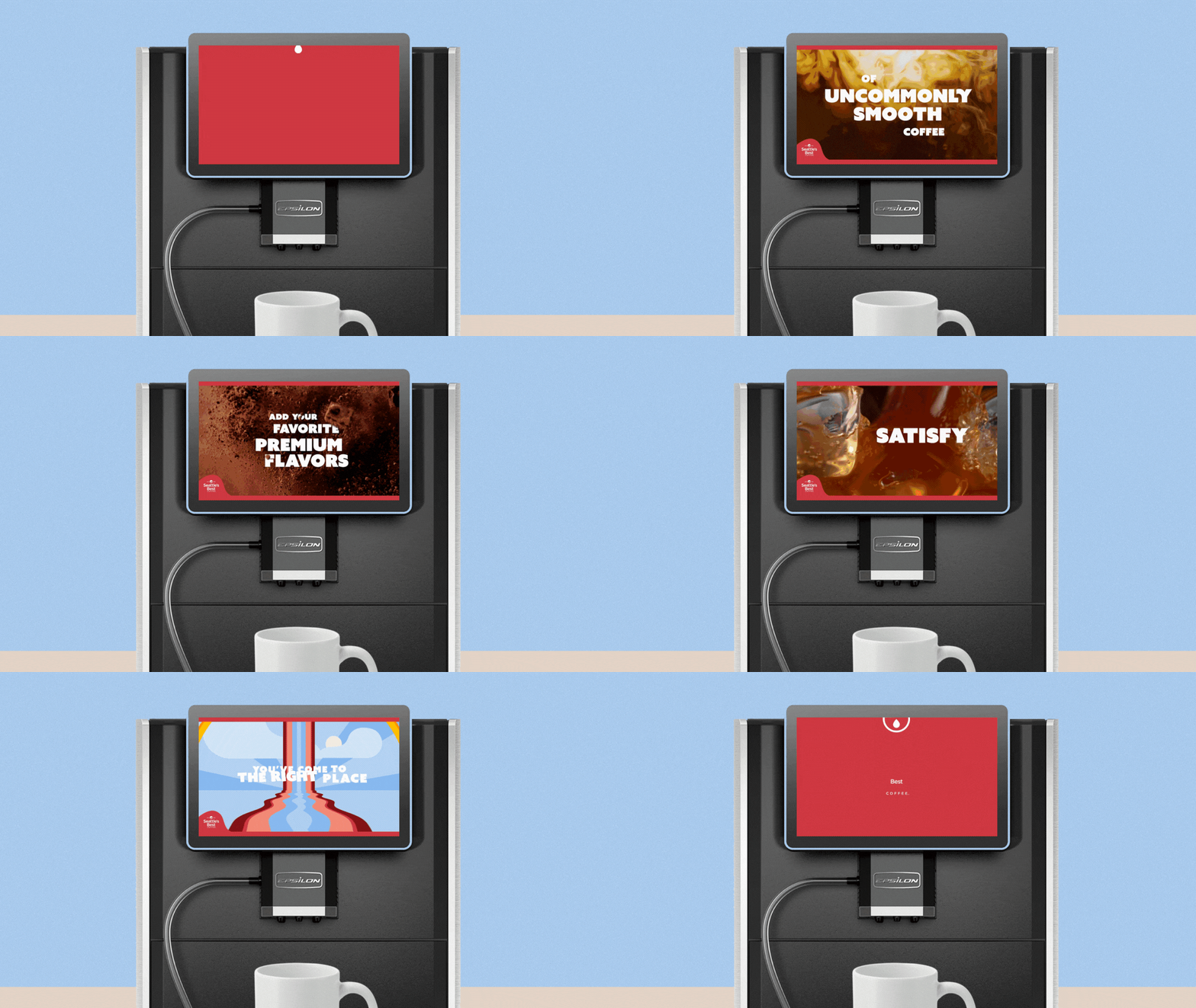
Brand layouts take inspiration from classic 70s advertising: full bleed photography, big and bold copy, and type that’s responsive to the photo itself. This kind of layout stands up to longer copy lines, which allow every asset to tell more of the brand’s story, develop more personality, and engage longer with the audience.
Serverware
Sales Materials
Brand Toolkit
![NCP22057_SBC_Rebrand_StyleSheet_060923 [Recovered]_Cover.jpg](https://images.squarespace-cdn.com/content/v1/5644f0dee4b0f6f3328ff1d3/1713241718875-CKA9CDFULXSGRMIFW6WO/NCP22057_SBC_Rebrand_StyleSheet_060923+%5BRecovered%5D_Cover.jpg)
![NCP22057_SBC_Rebrand_StyleSheet_060923 [Recovered]_Moodboard.jpg](https://images.squarespace-cdn.com/content/v1/5644f0dee4b0f6f3328ff1d3/1713241723274-T9QI6TJ2O241ZVR3EFC8/NCP22057_SBC_Rebrand_StyleSheet_060923+%5BRecovered%5D_Moodboard.jpg)
![NCP22057_SBC_Rebrand_StyleSheet_060923 [Recovered]_Logo.jpg](https://images.squarespace-cdn.com/content/v1/5644f0dee4b0f6f3328ff1d3/1713241730302-0WHIWUDIWUG96FX7IJS0/NCP22057_SBC_Rebrand_StyleSheet_060923+%5BRecovered%5D_Logo.jpg)
![NCP22057_SBC_Rebrand_StyleSheet_060923 [Recovered]_Color Palette.jpg](https://images.squarespace-cdn.com/content/v1/5644f0dee4b0f6f3328ff1d3/1713241734094-WXX9WBYTTWX1W69YKLV4/NCP22057_SBC_Rebrand_StyleSheet_060923+%5BRecovered%5D_Color+Palette.jpg)
![NCP22057_SBC_Rebrand_StyleSheet_060923 [Recovered]_Typefaces.jpg](https://images.squarespace-cdn.com/content/v1/5644f0dee4b0f6f3328ff1d3/1713241738800-TDJXL3152H7K4WY7VIY3/NCP22057_SBC_Rebrand_StyleSheet_060923+%5BRecovered%5D_Typefaces.jpg)
![NCP22057_SBC_Rebrand_StyleSheet_060923 [Recovered]_TypeTreatment.jpg](https://images.squarespace-cdn.com/content/v1/5644f0dee4b0f6f3328ff1d3/1713241747233-UEE7H4C4NK27JO31T3EU/NCP22057_SBC_Rebrand_StyleSheet_060923+%5BRecovered%5D_TypeTreatment.jpg)
![NCP22057_SBC_Rebrand_StyleSheet_060923 [Recovered]_TypeHierarchy.jpg](https://images.squarespace-cdn.com/content/v1/5644f0dee4b0f6f3328ff1d3/1713241747233-SNEW3UY2HFT8CSGJ8ZET/NCP22057_SBC_Rebrand_StyleSheet_060923+%5BRecovered%5D_TypeHierarchy.jpg)
![NCP22057_SBC_Rebrand_StyleSheet_060923 [Recovered]_Photography.jpg](https://images.squarespace-cdn.com/content/v1/5644f0dee4b0f6f3328ff1d3/1713241750172-PAJJWJPZN7MEU9QXQA8P/NCP22057_SBC_Rebrand_StyleSheet_060923+%5BRecovered%5D_Photography.jpg)
![NCP22057_SBC_Rebrand_StyleSheet_060923 [Recovered]_Illustration.jpg](https://images.squarespace-cdn.com/content/v1/5644f0dee4b0f6f3328ff1d3/1713241750582-WQJELE9GYQ5QX9DHIVNA/NCP22057_SBC_Rebrand_StyleSheet_060923+%5BRecovered%5D_Illustration.jpg)
![NCP22057_SBC_Rebrand_StyleSheet_060923 [Recovered]_GraphicFrame.jpg](https://images.squarespace-cdn.com/content/v1/5644f0dee4b0f6f3328ff1d3/1713241752124-DUYP1HP4TC17TEVVAKWO/NCP22057_SBC_Rebrand_StyleSheet_060923+%5BRecovered%5D_GraphicFrame.jpg)


