

Promised Land Dairy
Branding & Identity, Packaging
🏆 Muse Awards Platinum Winner
🏆 Shorty Awards Bronze Honor
🏆 Shorty Awards Audience Honor
🏆 Hermes Platinum Winner
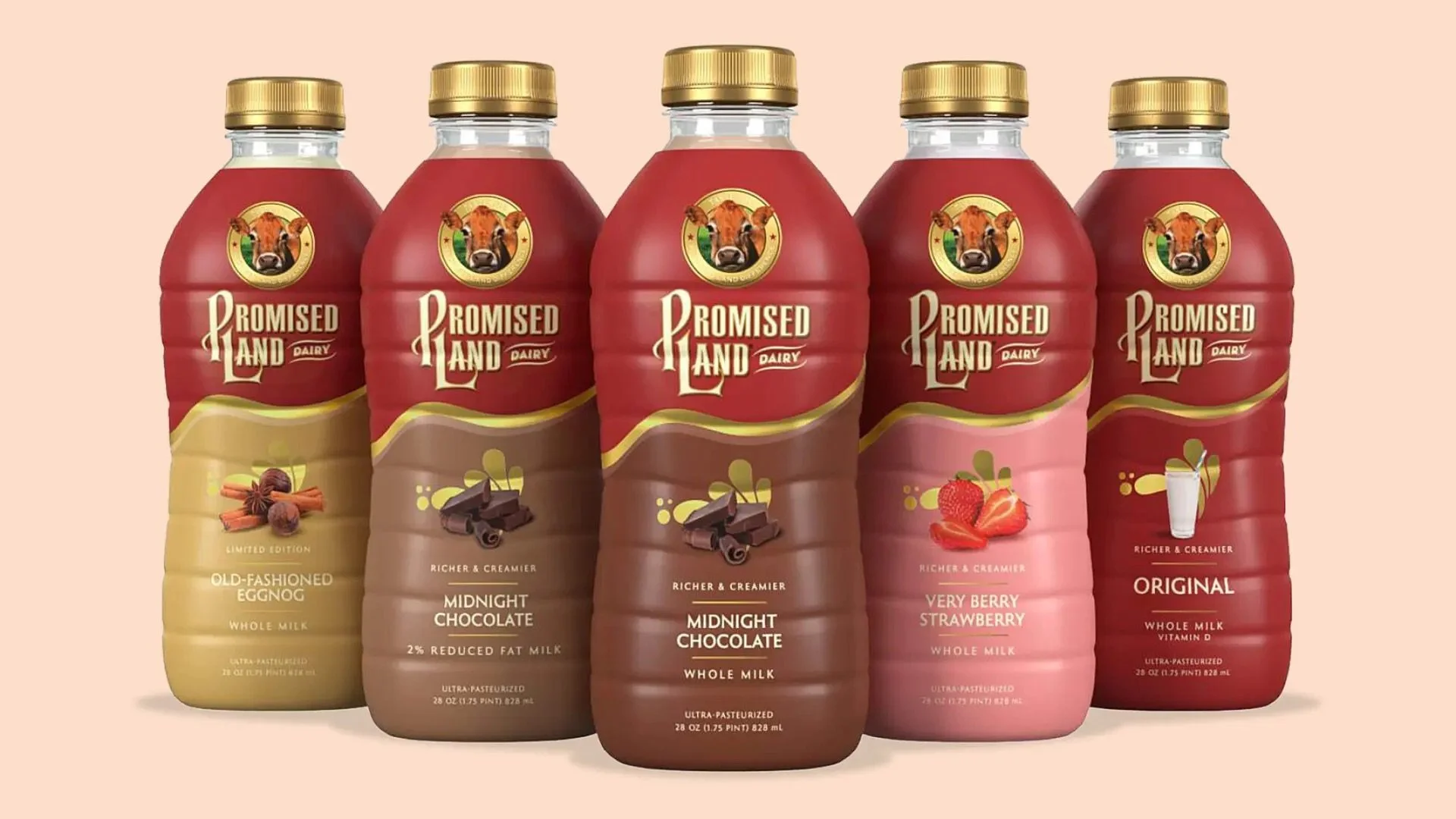
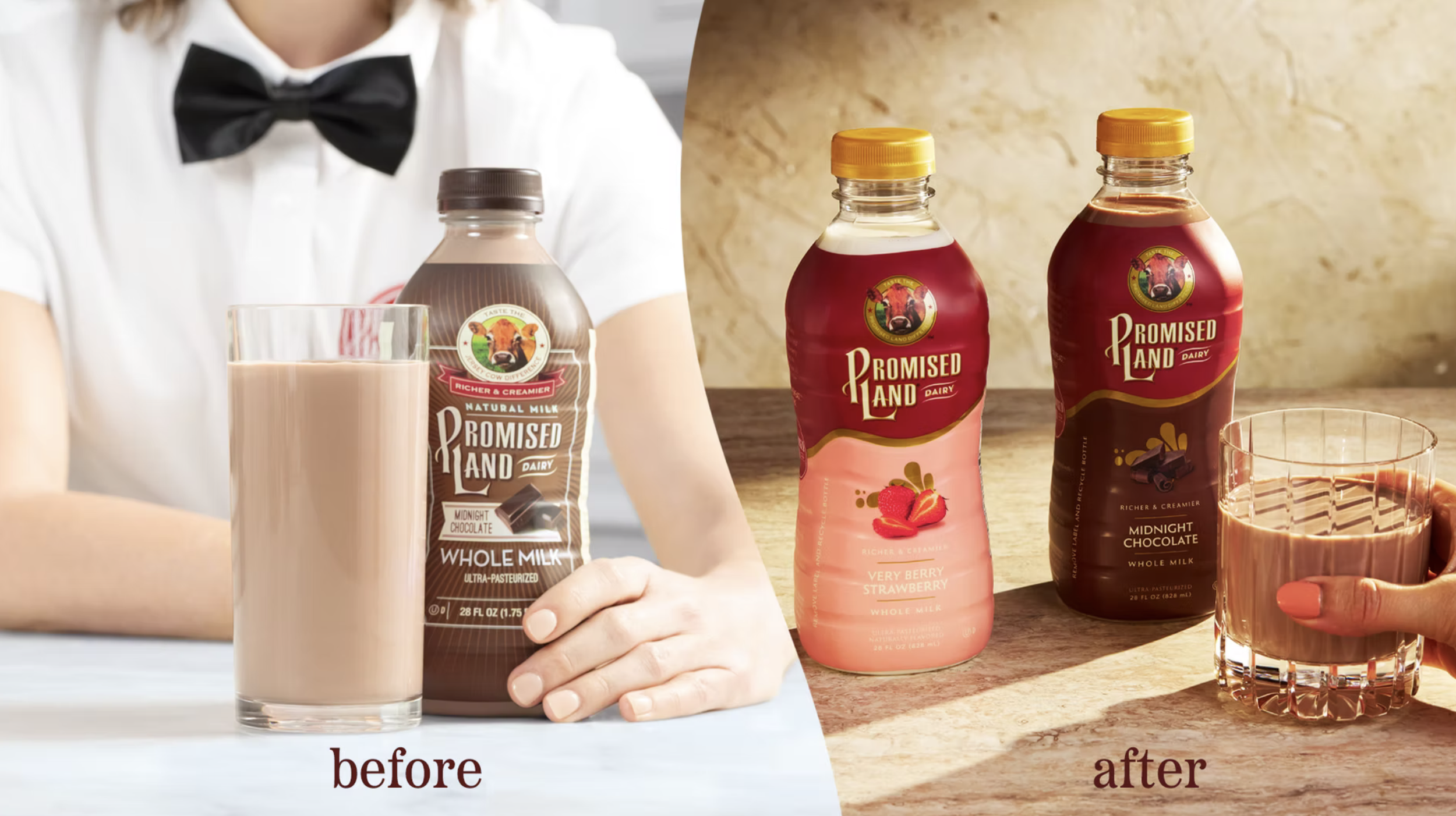
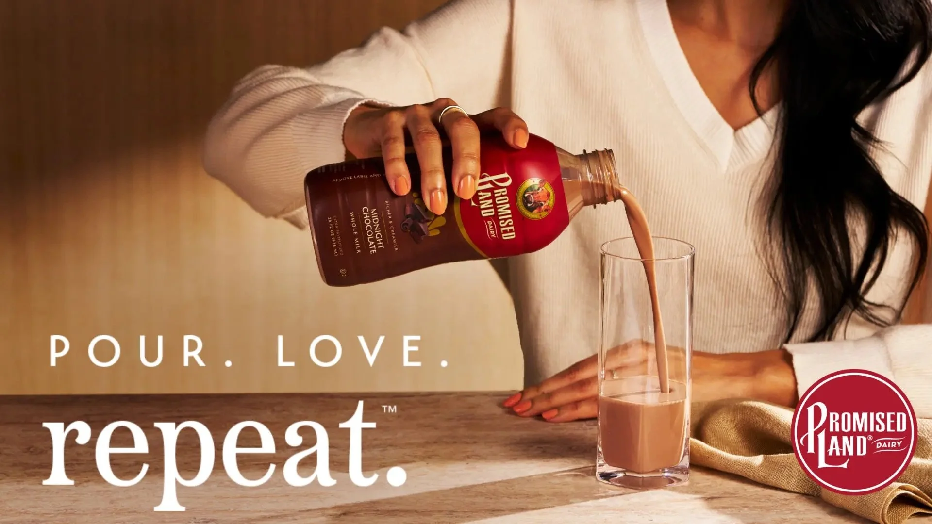
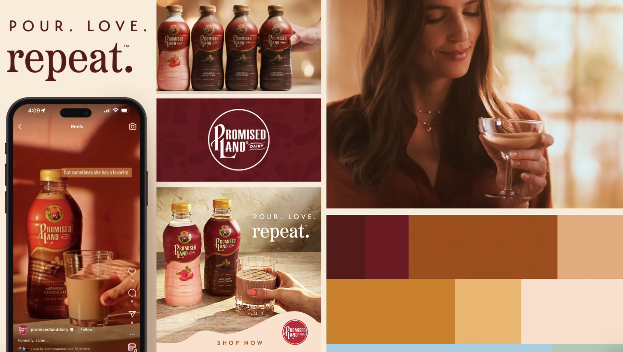
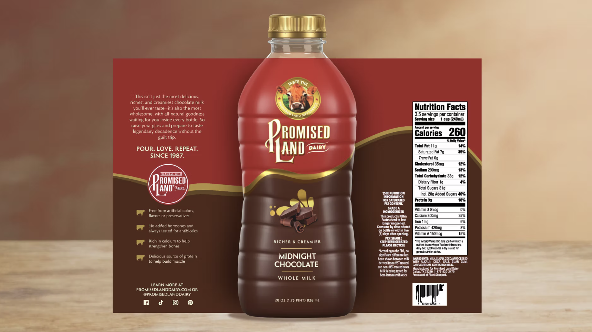
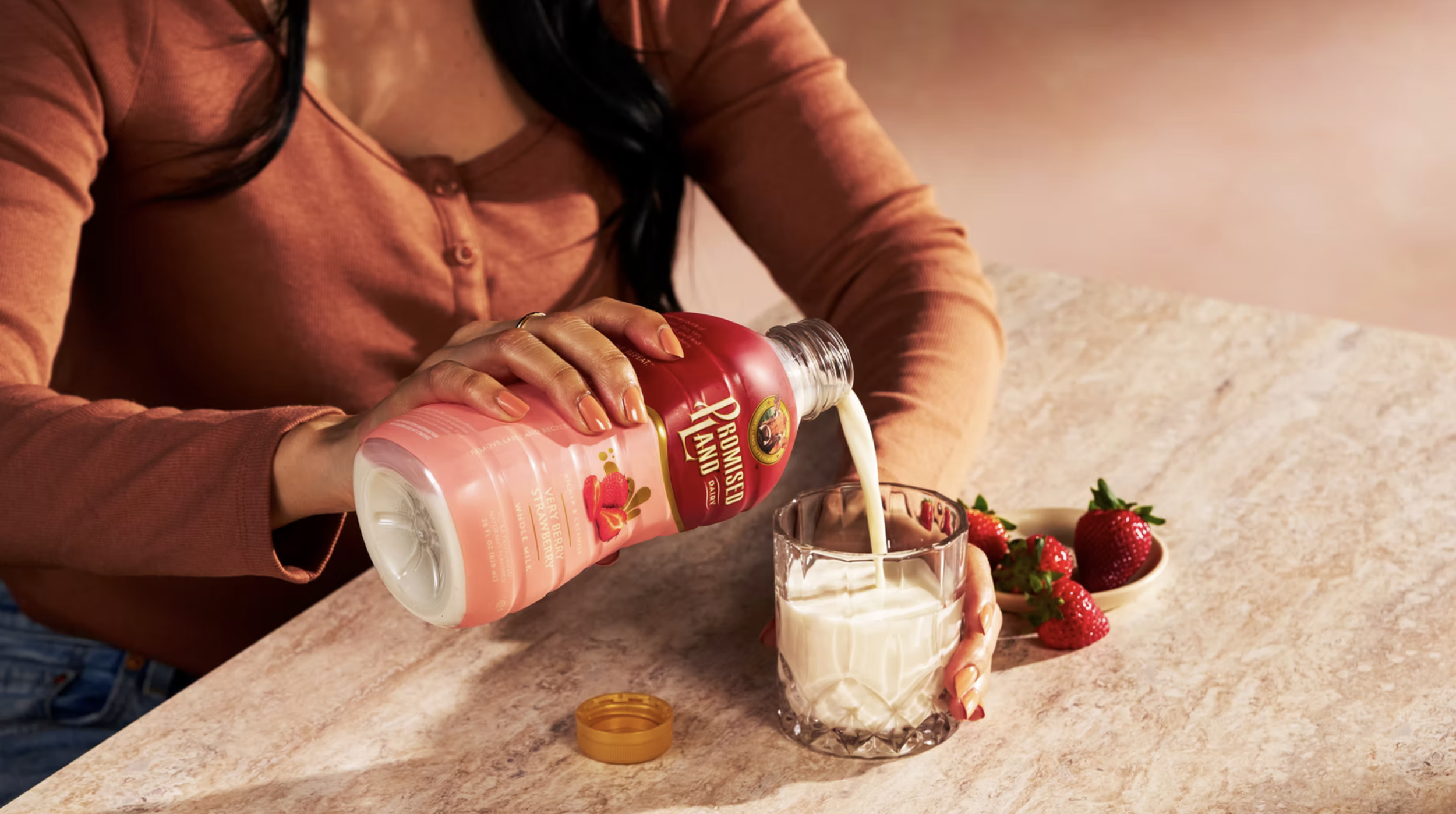
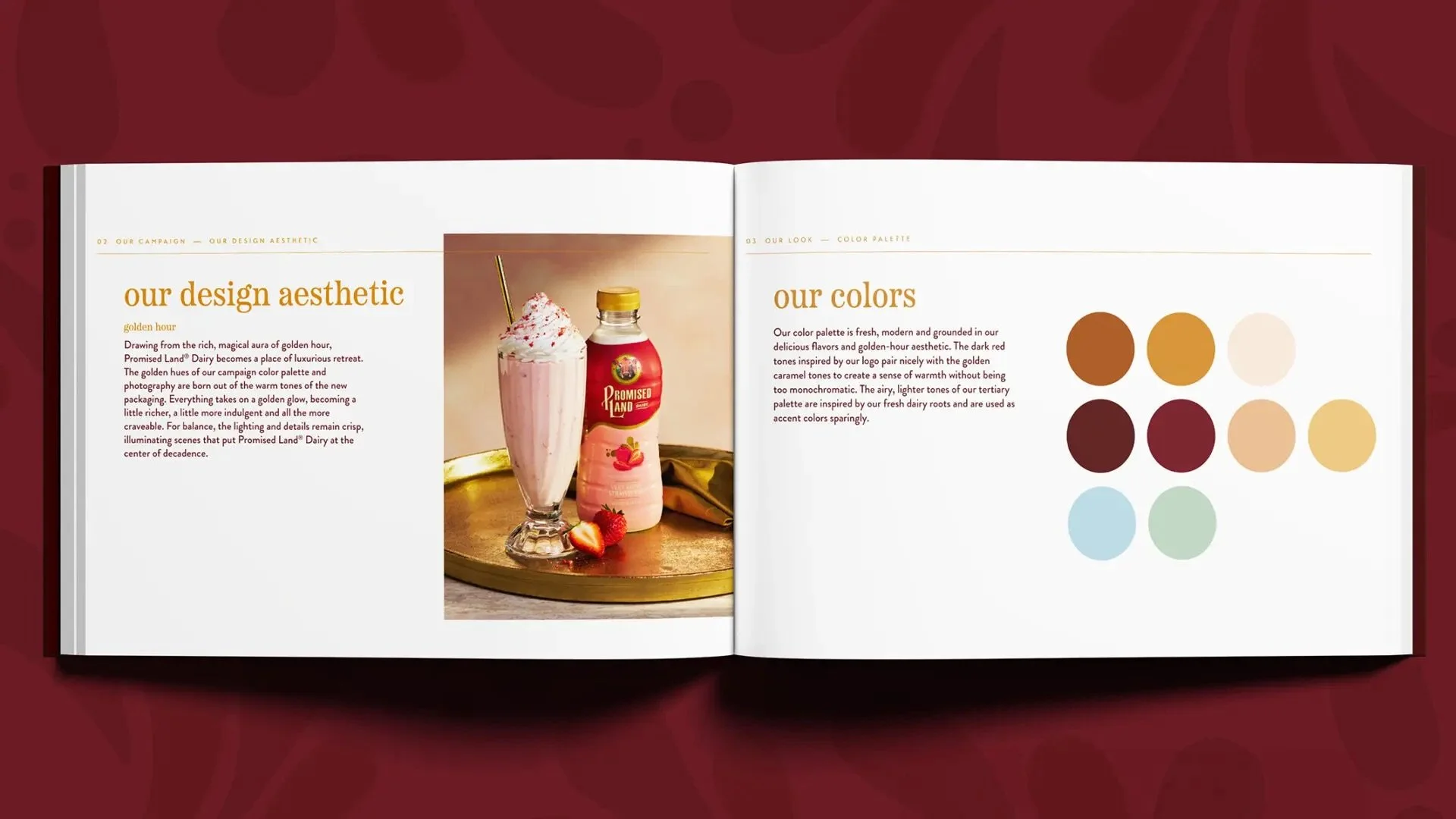
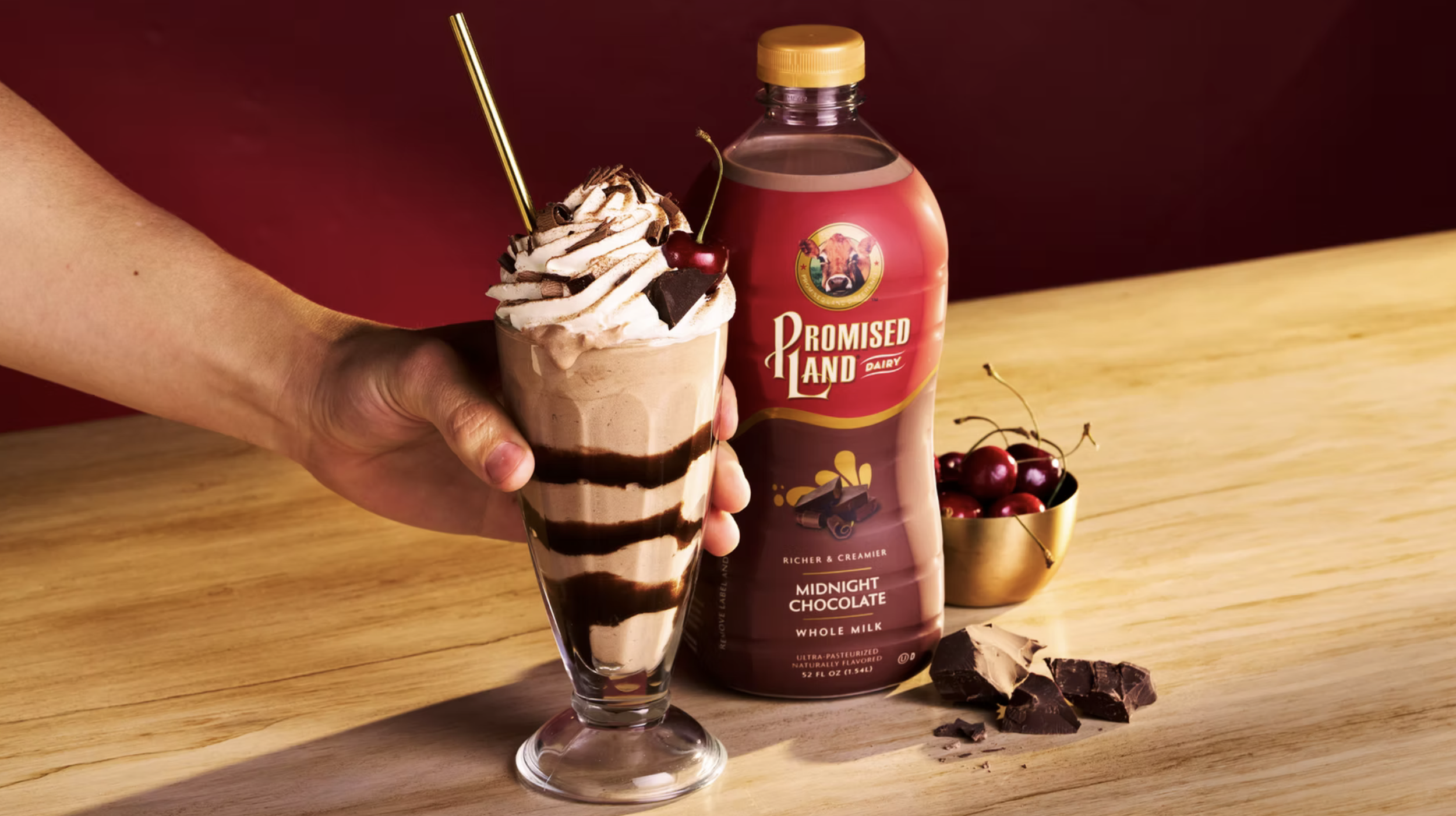
Promised Land Dairy needed to stand out in-aisle, expand distribution, and build on an already loyal following. We led a bold brand refresh, repositioning the brand from everyday staple to considered indulgence. By thoughtfully evolving the visual identity into a more refined and elevated expression, we preserved existing equity while creating a richer, more compelling world for new audiences. The result is a brand that invites a slower, more intentional experience—premium, but still familiar. This shift reframes Promised Land from commodity to lifestyle, strengthening emotional connection and reinforcing the value behind both the product and its price.
Results
Kroger, Walmart, Giant, and Wegmans adopt nationwide distribution
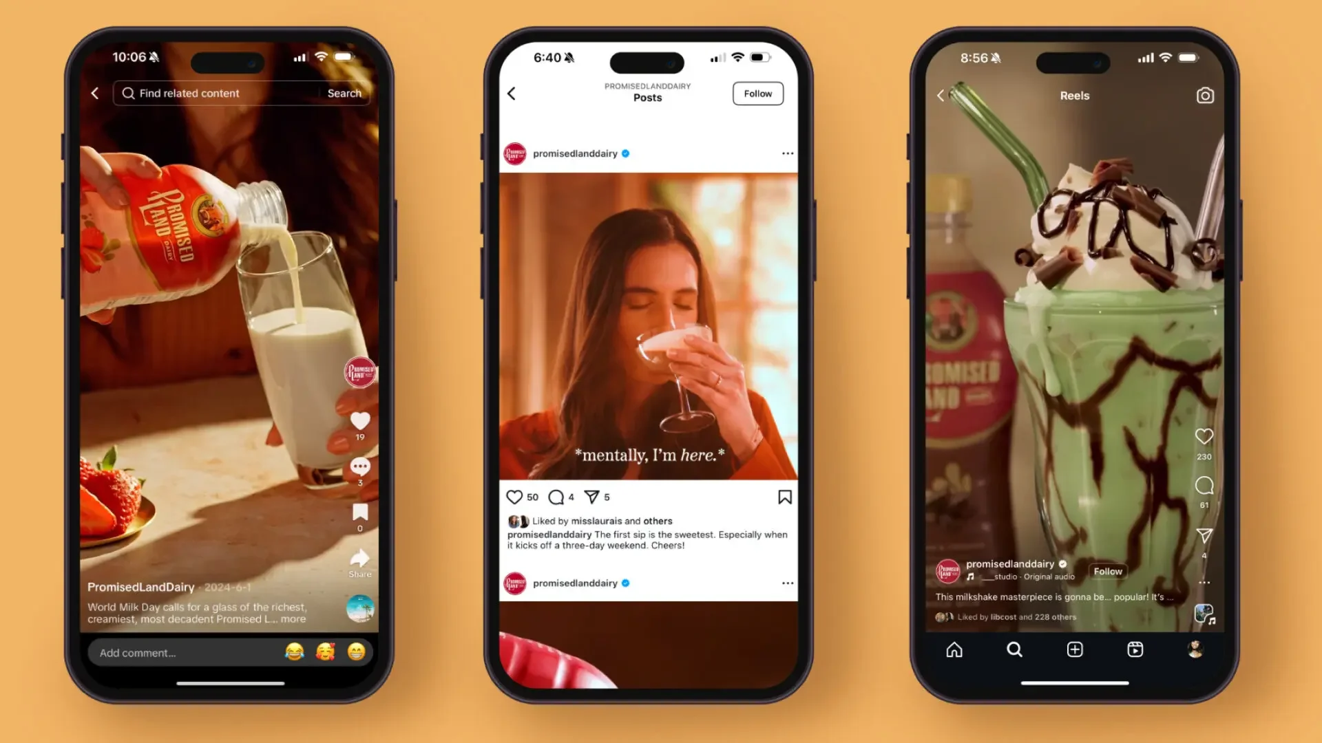
+49% increase in Instagram follower growth
+8.3% increase in dollar sales, YOY
+9.8% Instagram in-feed post engagement rate
+13.2% in unit sales, YoY
+73% increase in average number of views, Reels


Additional Credits:
ECD: Kat Tushim, ACD: Sunshine Lemontree, AD: Josephine Kostusiak, Producer: Stephanie Spiegel, Photographer/Director: Dan Goldberg, Videographers: Wilbert Cheng, Tyllie Barbosa