Chapter
Aesthetic Studio, Branding & Identity
Role: Brand Strategy, Design Lead
Awards: Chief Marketer Pro Award, Best Health & Wellness Campaign, Bronze
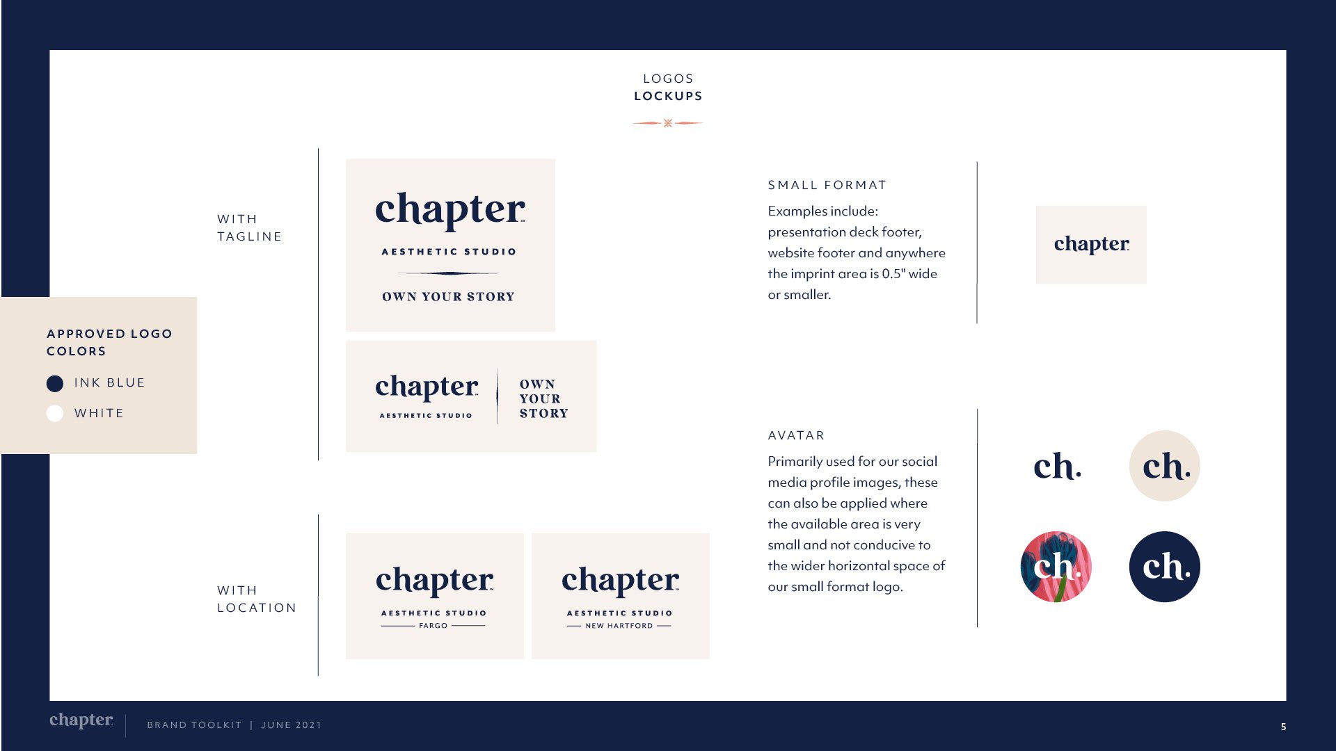
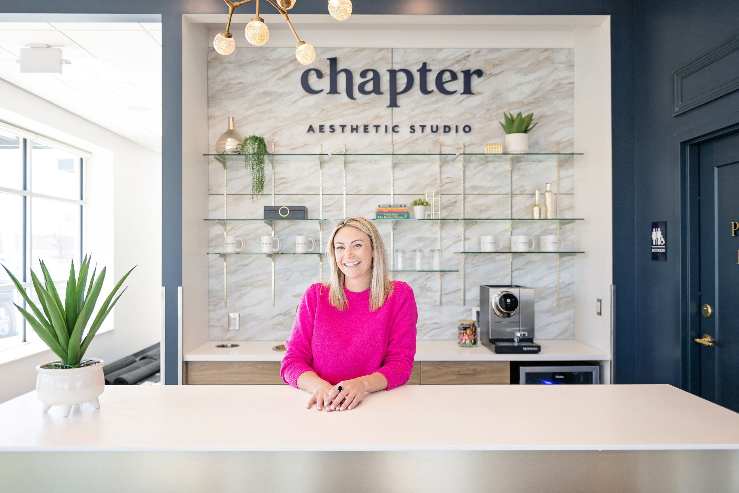
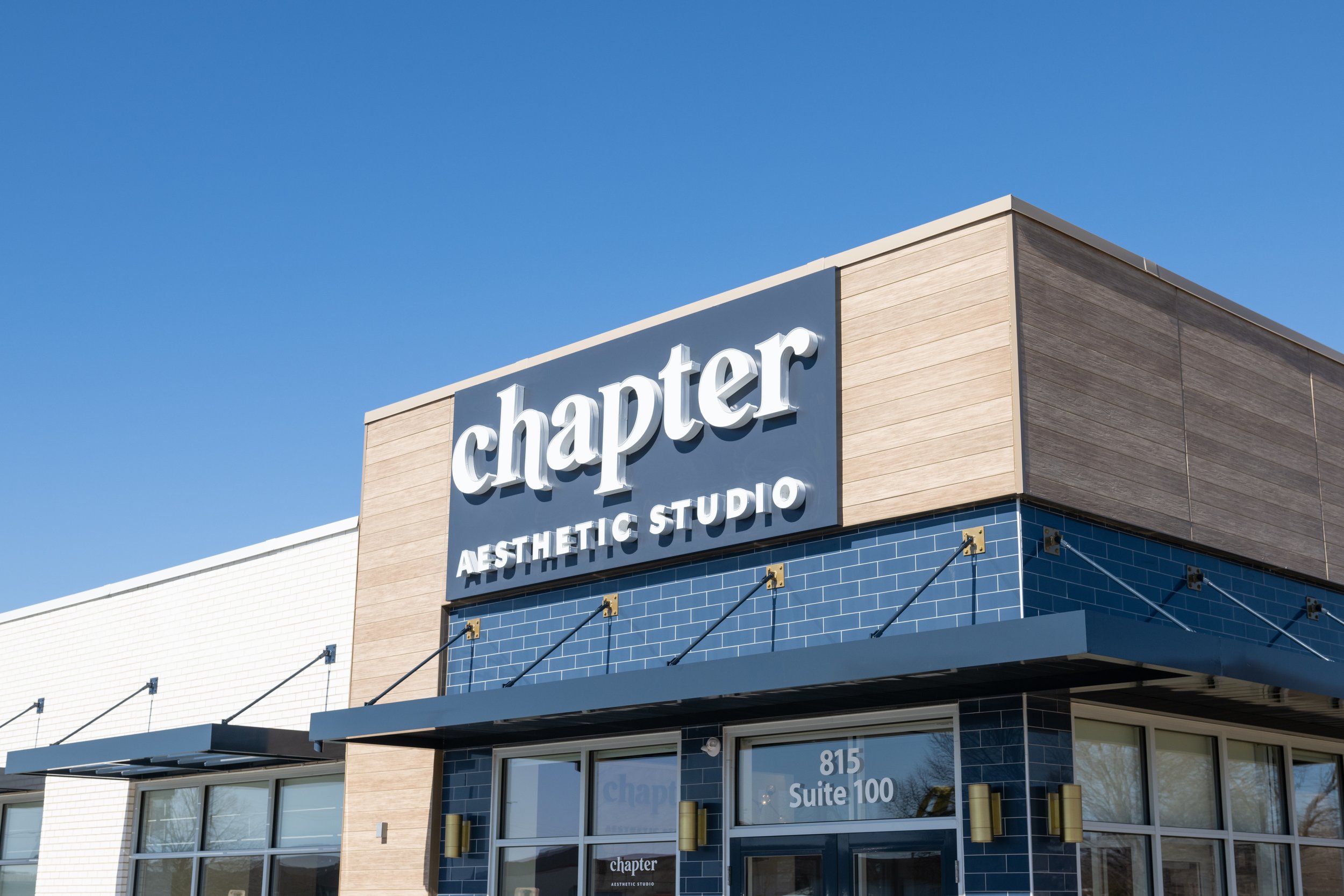
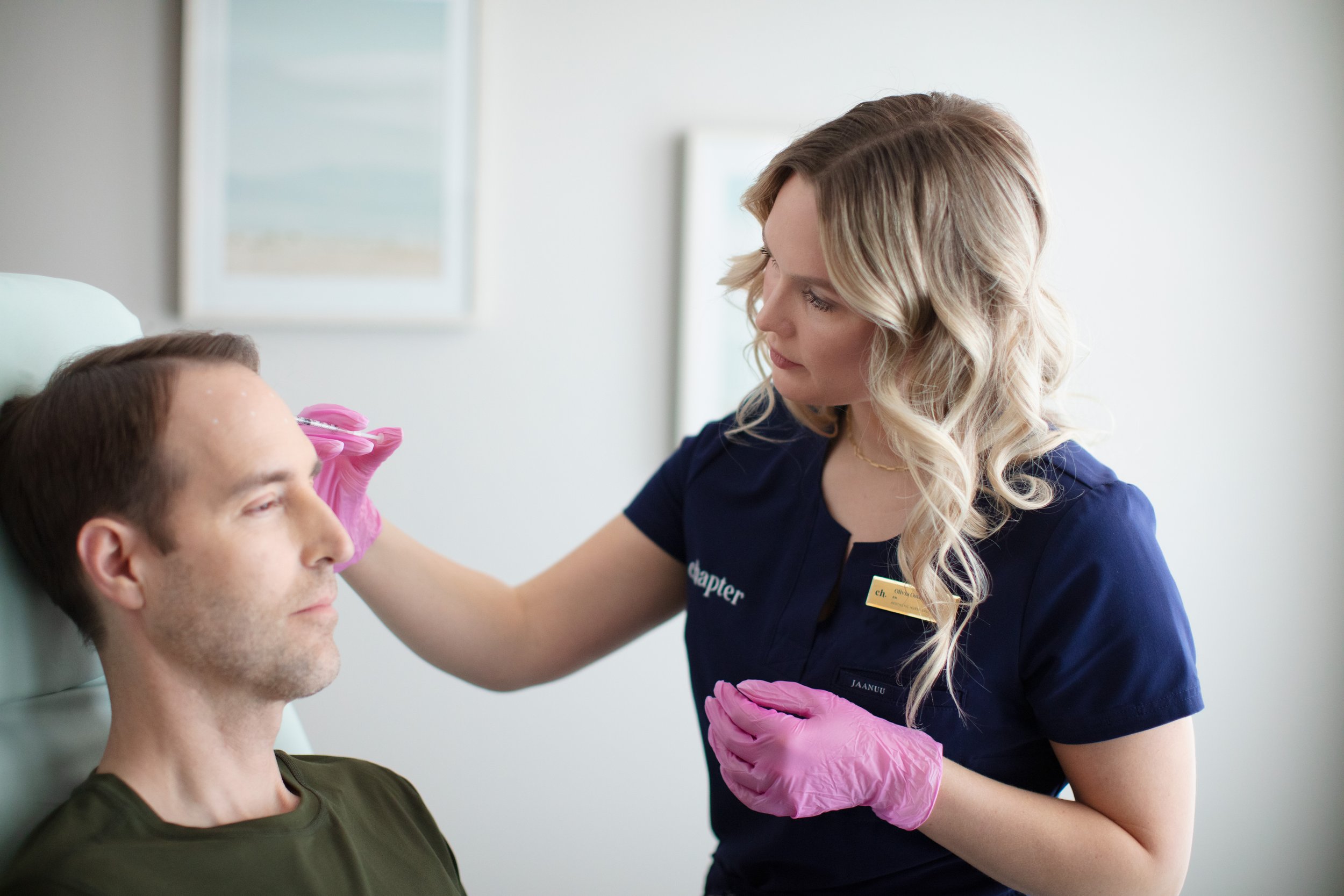
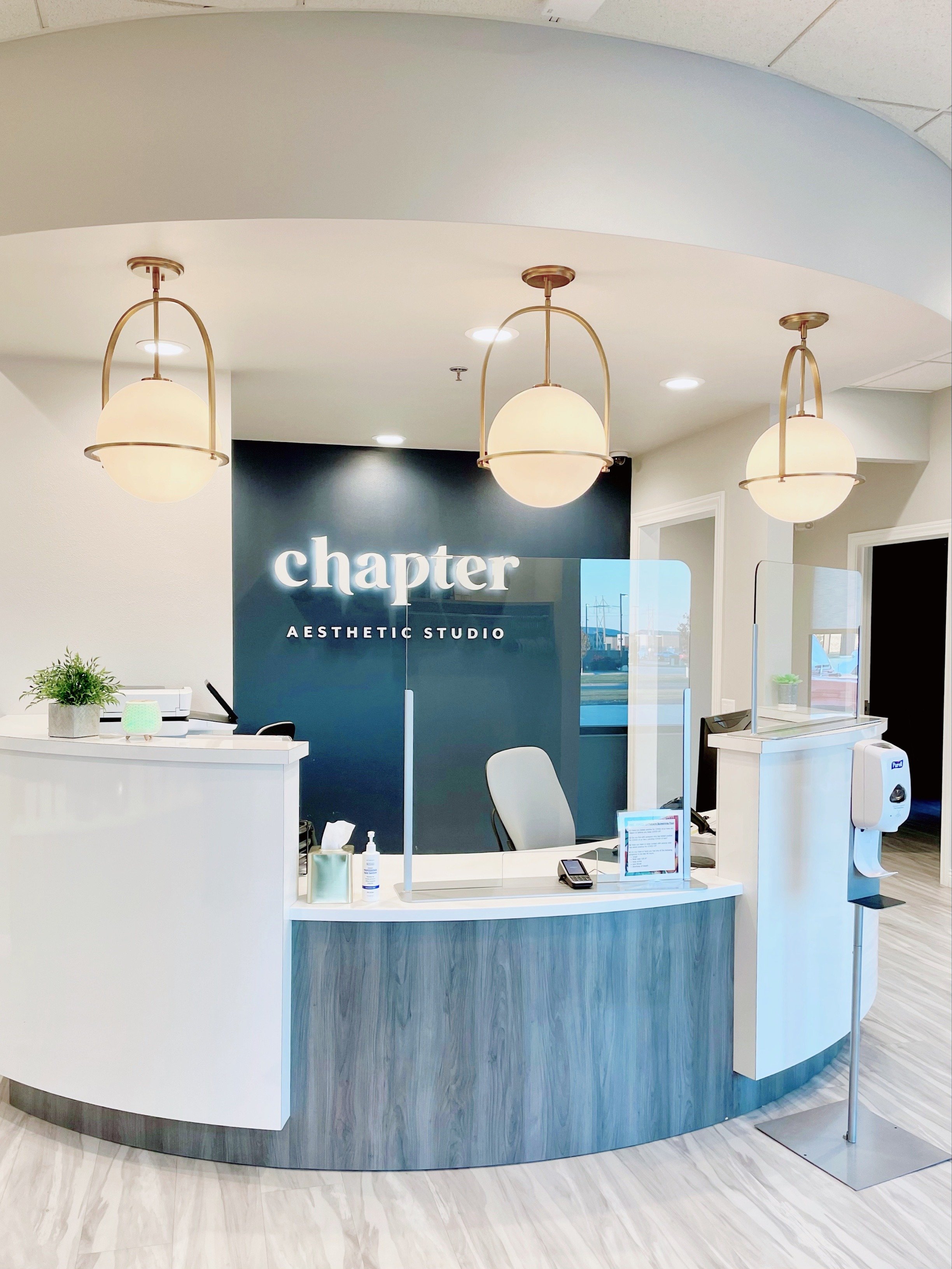
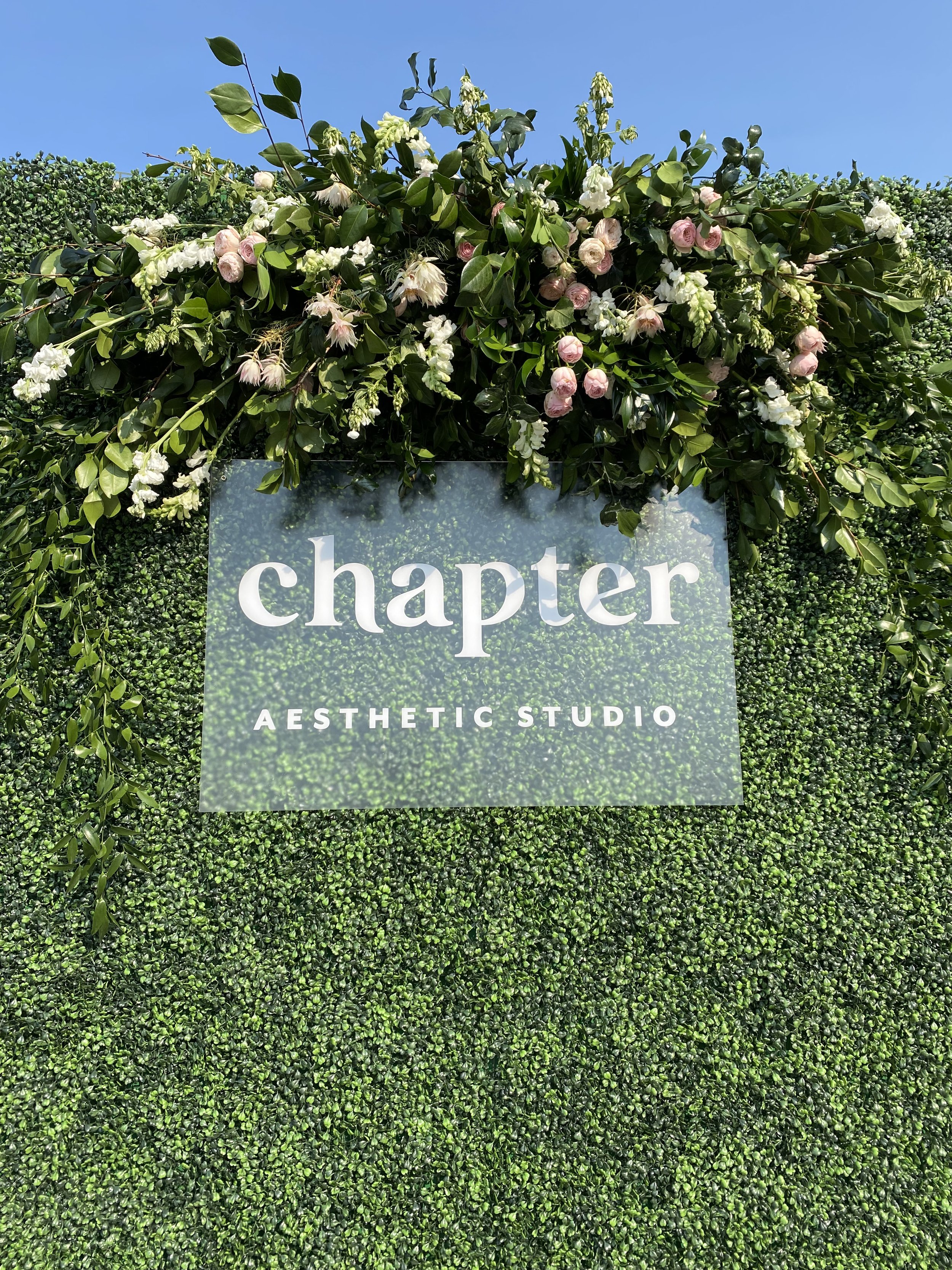
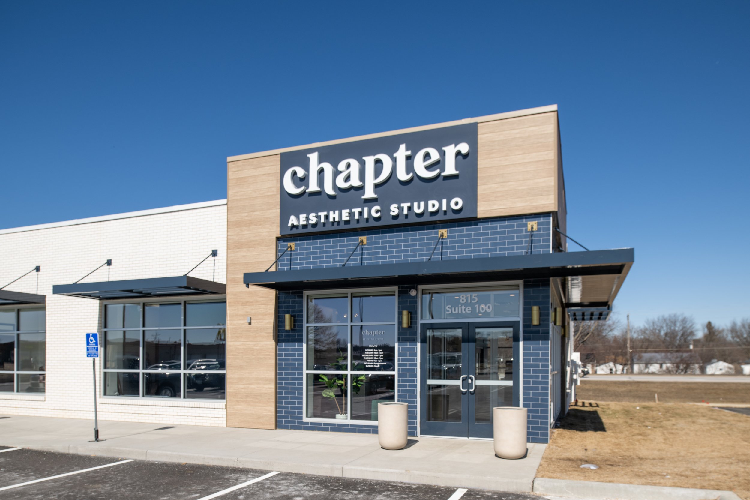
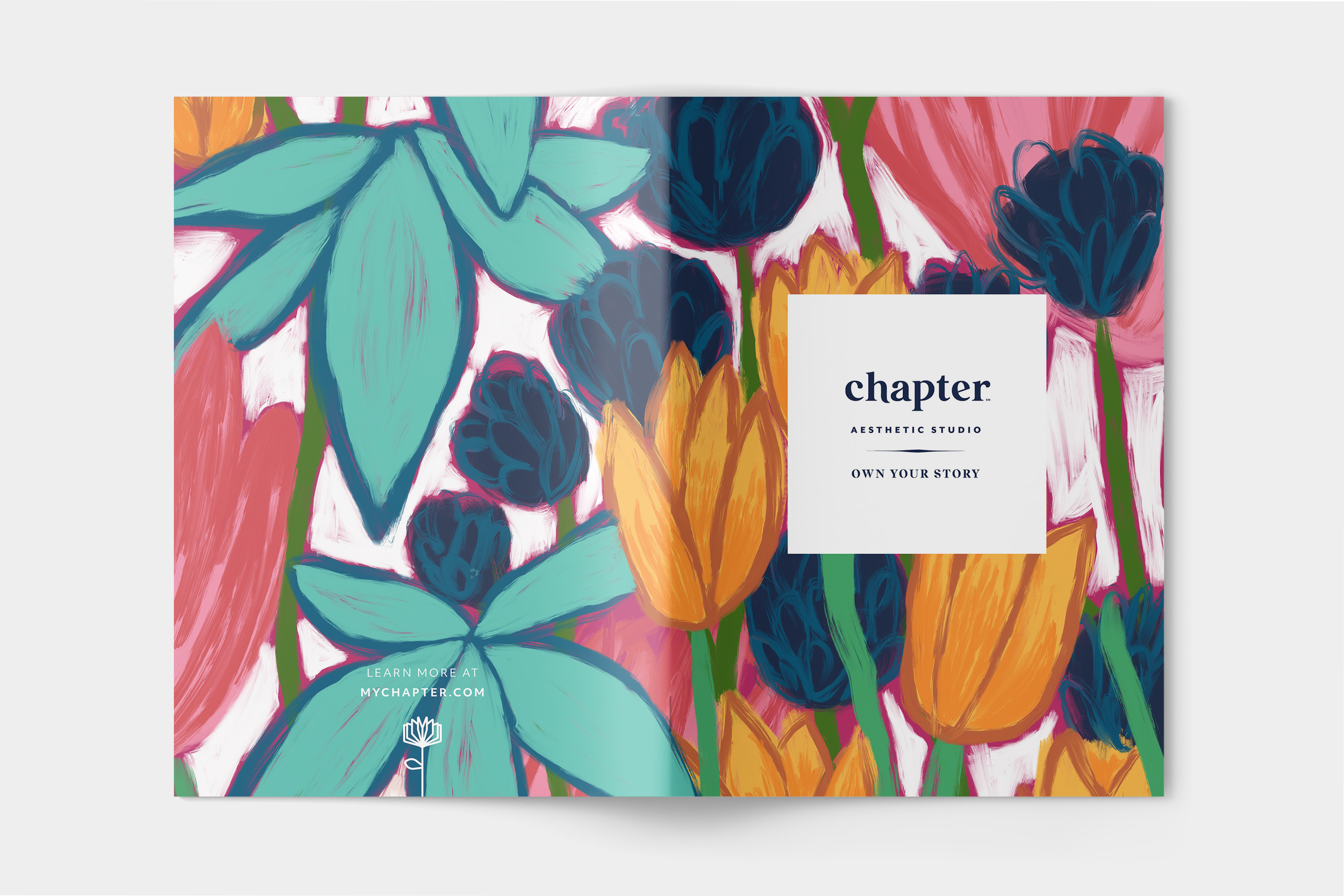
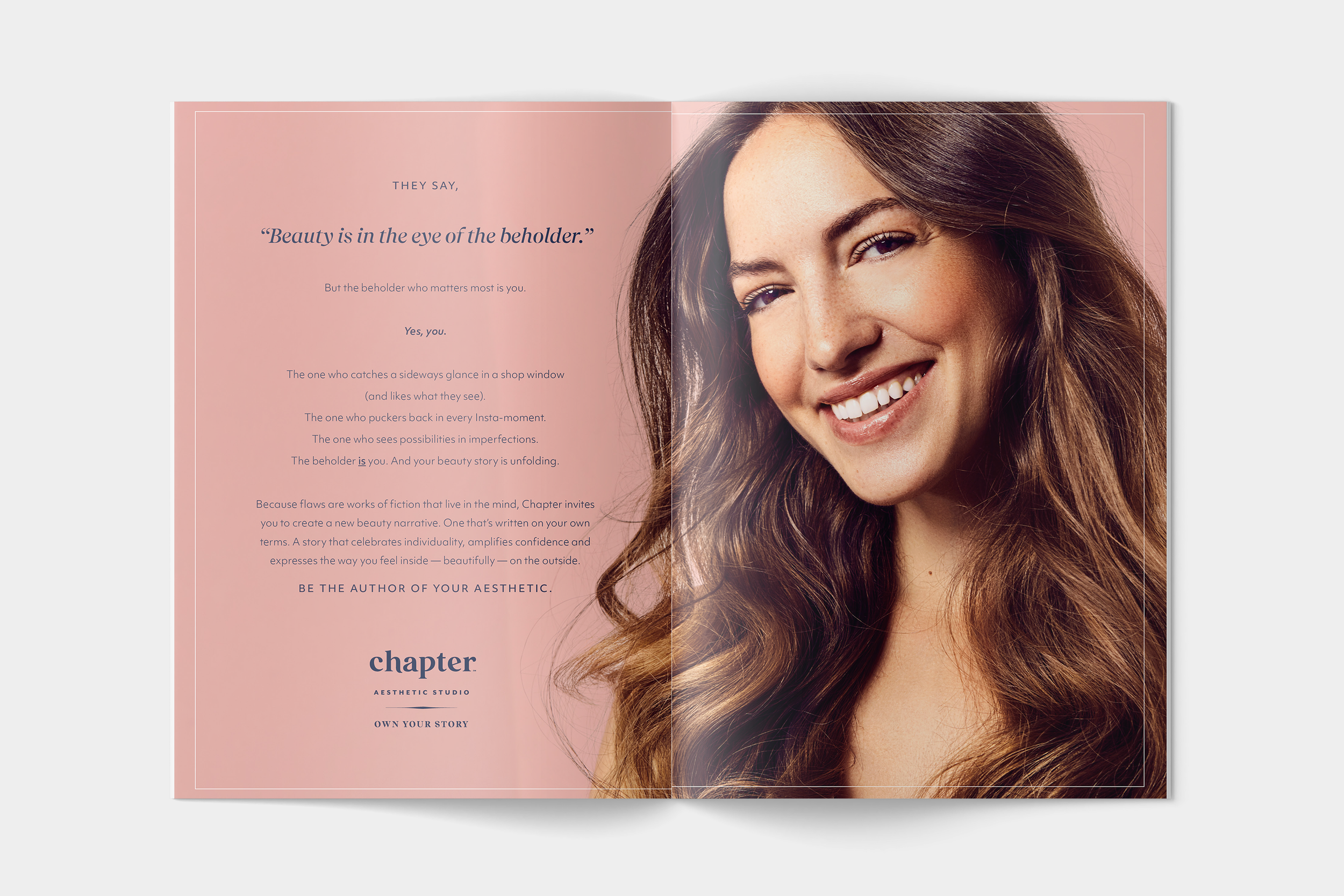
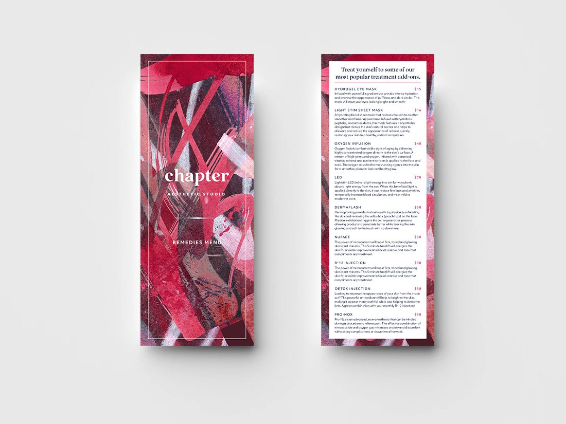
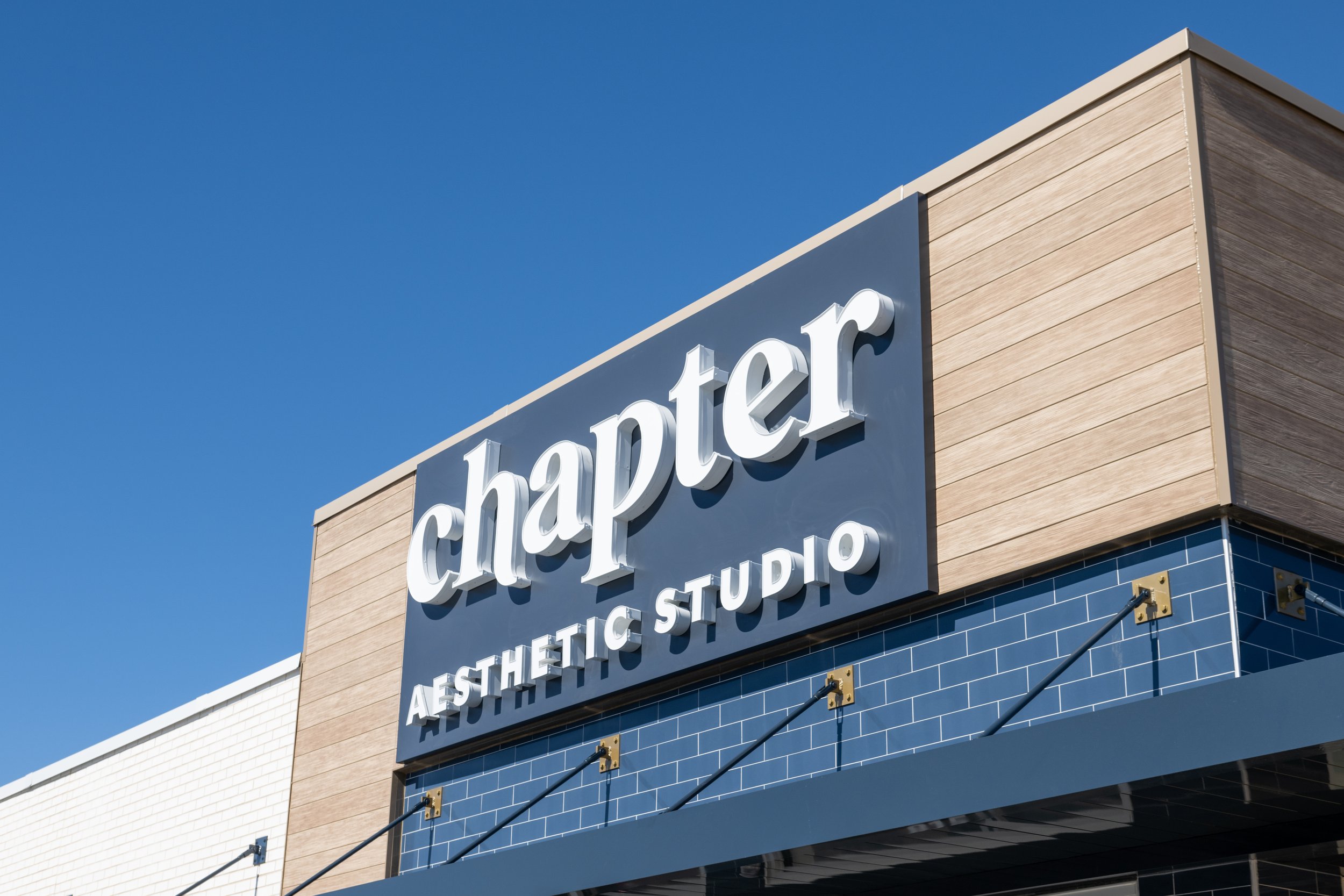
Chapter is a new kind of aesthetic studio from The Aspen Group. To set them apart from the sterile and clinical competition, I developed a visual identity that strikes a balance of trustworthy, credentialed professionalism with artistic expression and individuality.
Inspiration includes vintage book layouts as an elegant nod to the literary name, and expressive, hand-painted illustrations and textures to build a feeling of humanity and individuality.
Moodboard
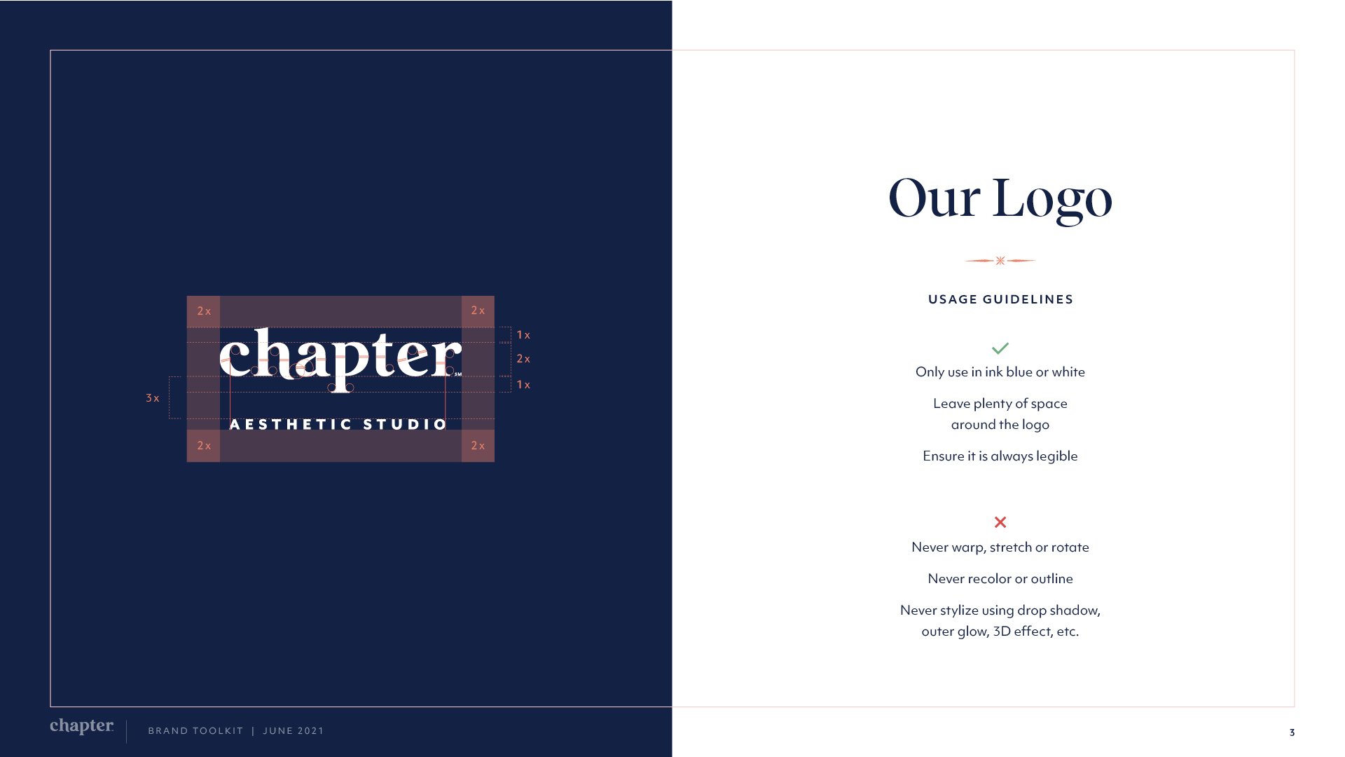
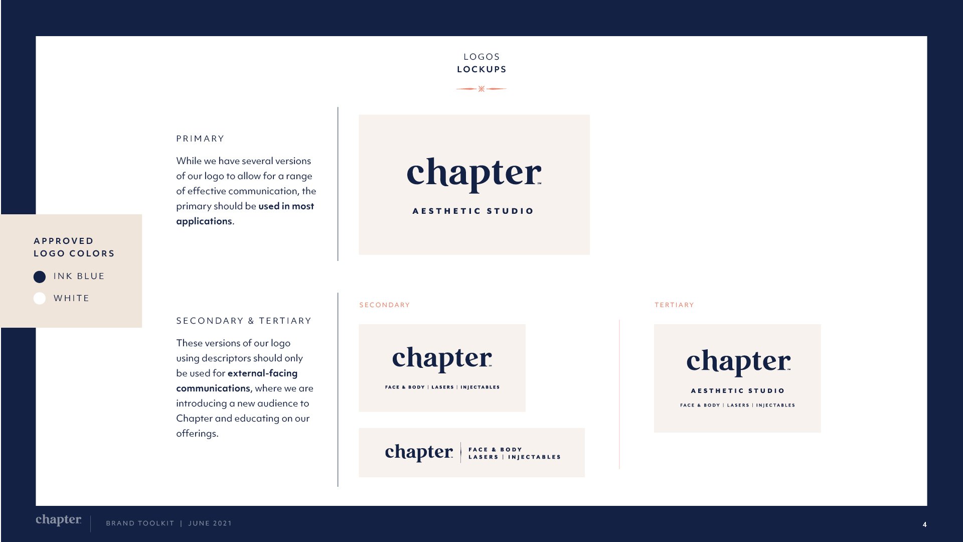
Logo
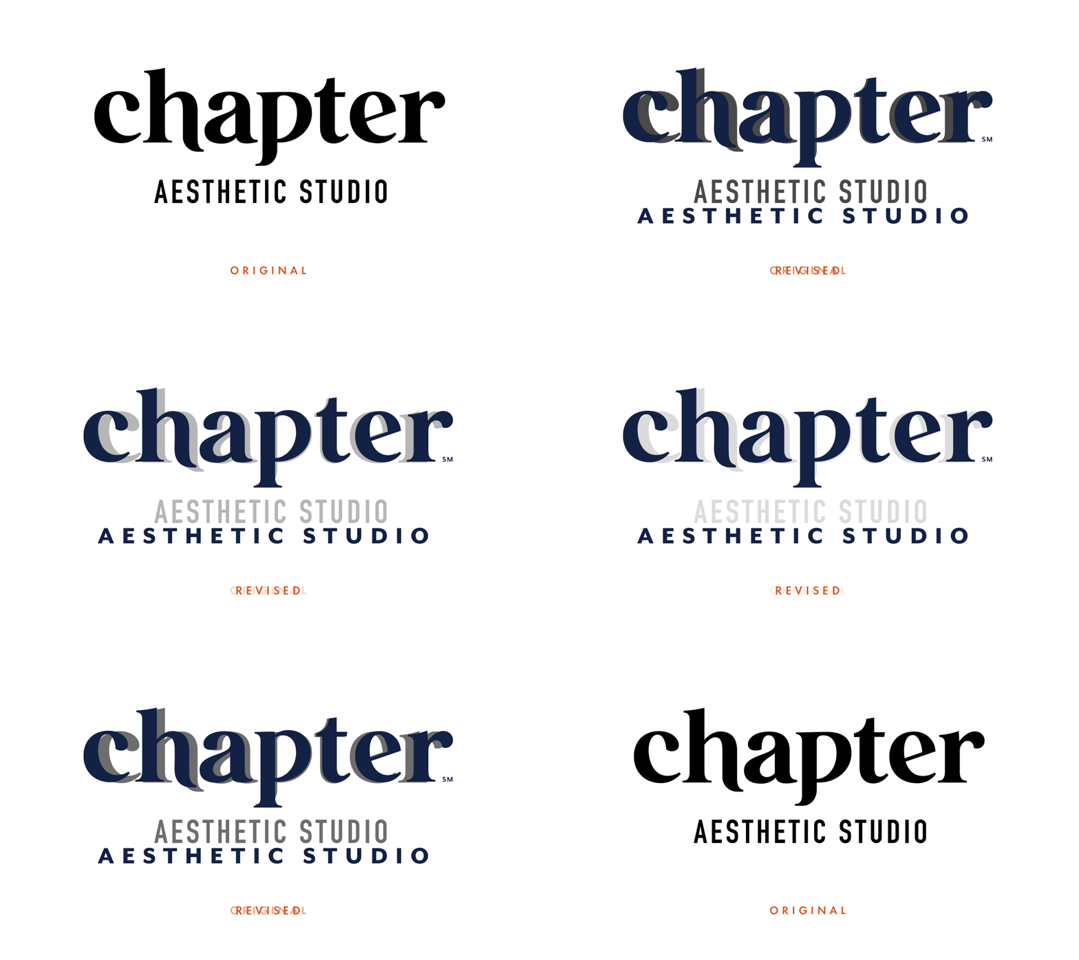
Logo Redrafting
Adding letter spacing and adjusting letterforms gave the logo better legibility and more refinement, polish and credibility.
Brand Case Study Video
In-studio Treatment Guide
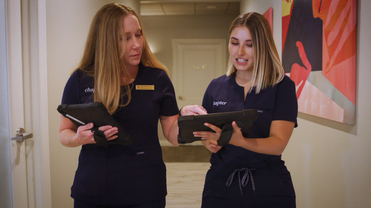
We created an app for the aesthetic advisors to use as a guide as they set up new guests with their treatment plans.
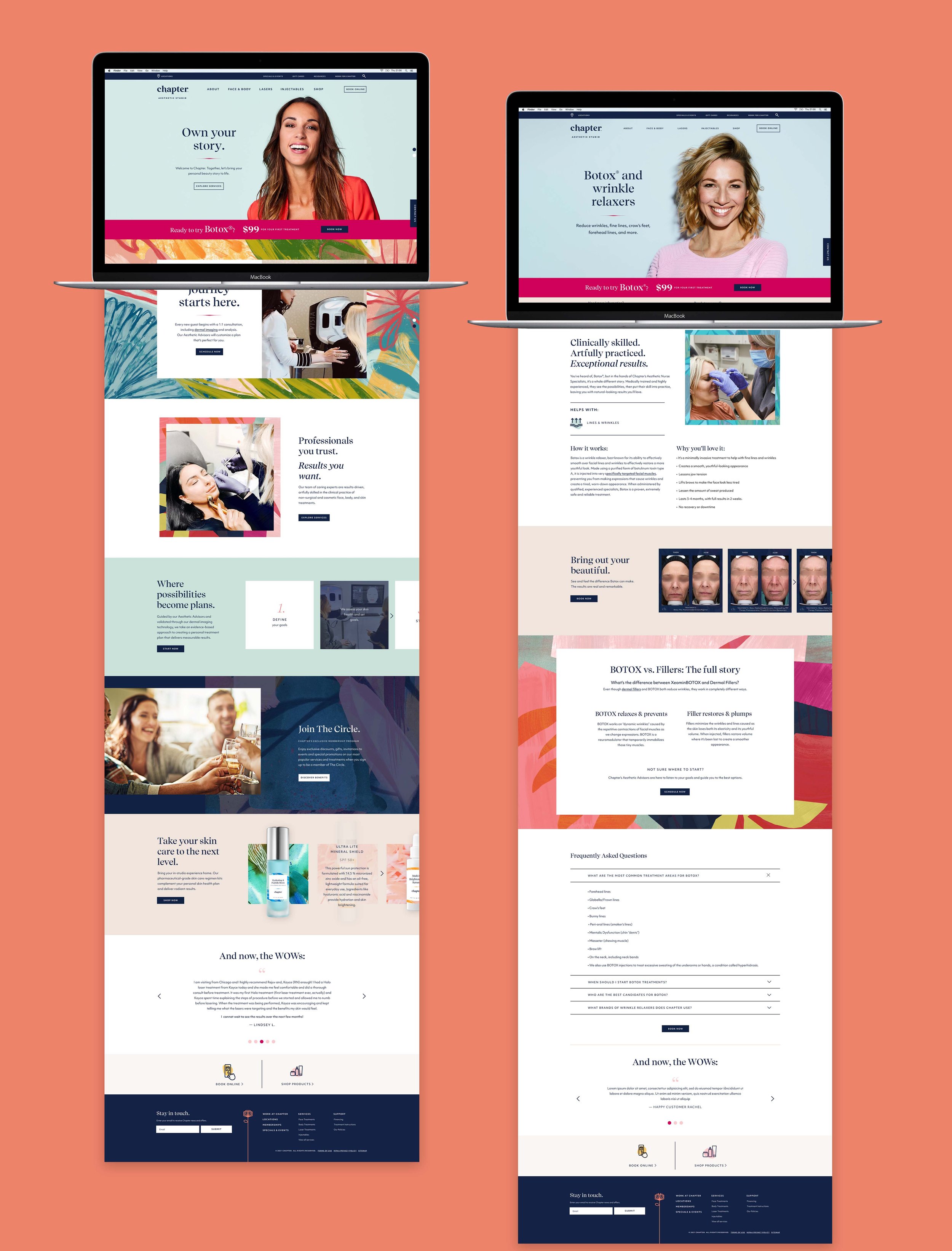
Website Design
I worked closely with our lead UX designer Suzanne Deveney to design the brand’s 45+ page website within a few months for launch.
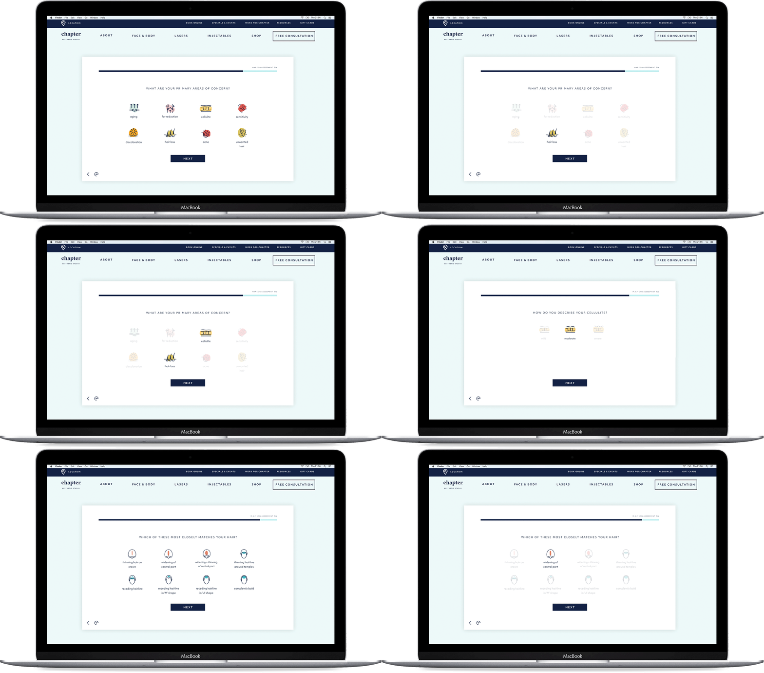
Treatment Diagnostic Quiz
Suzanne and I also developed a web-based diagnostic quiz to guide people to the treatments that would be a match for them based on their concerns and goals.
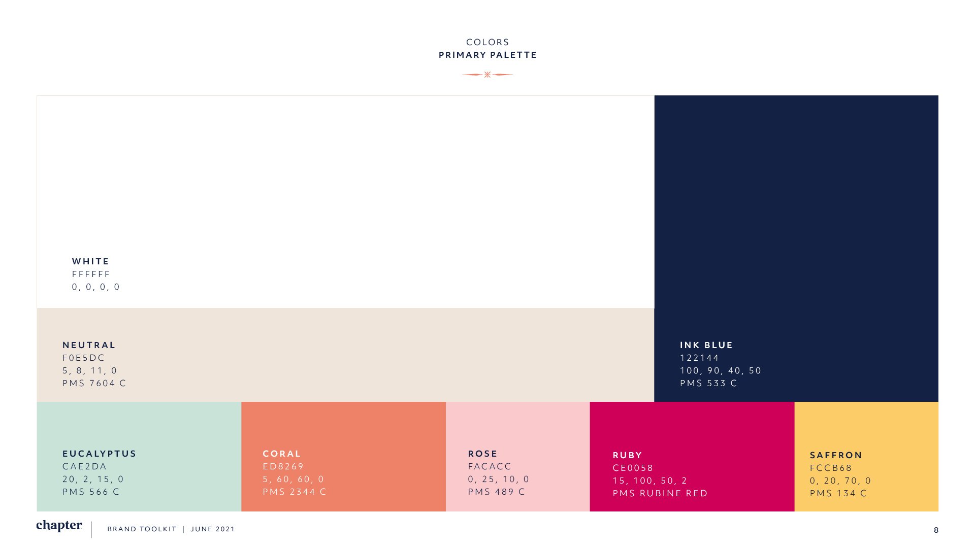
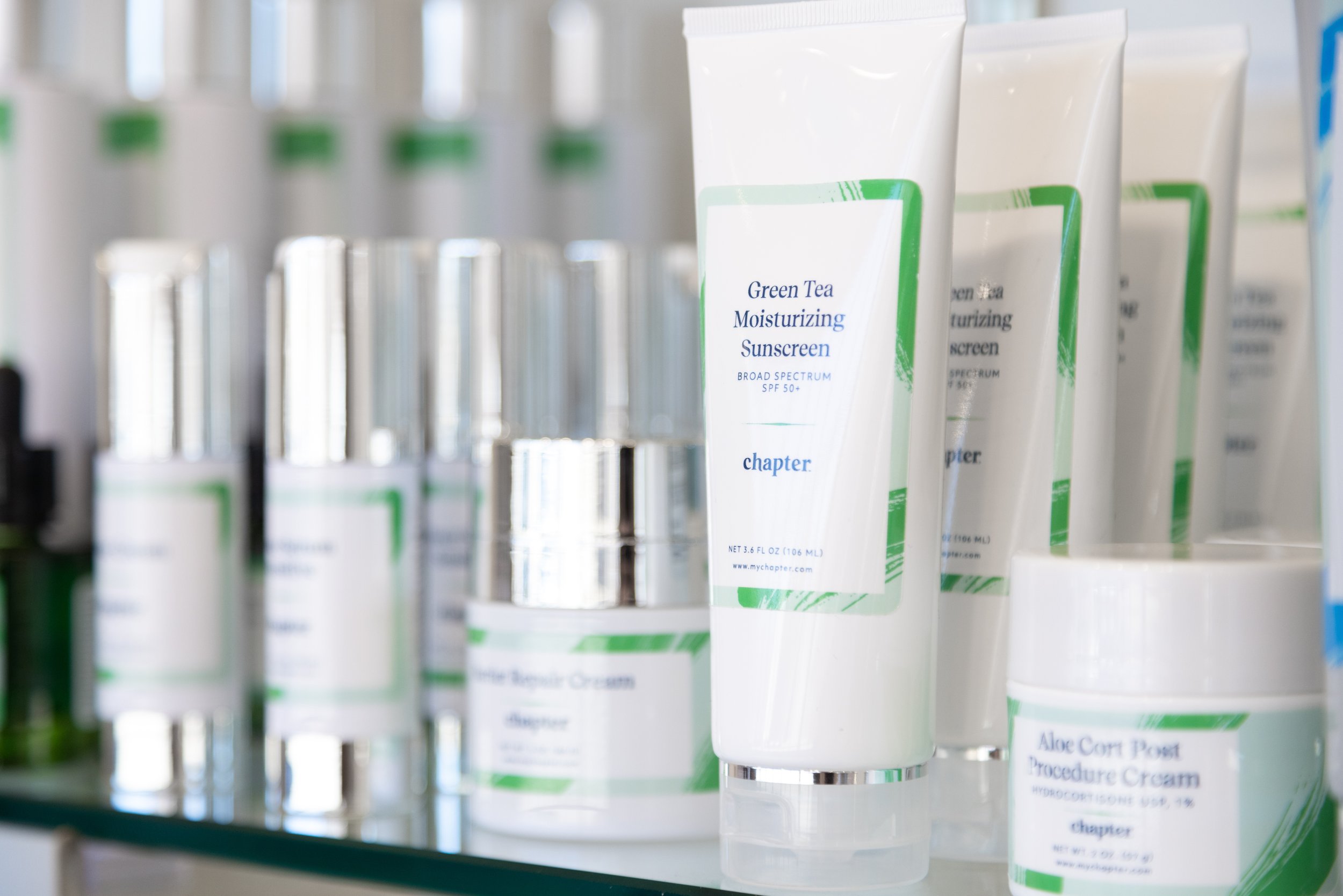
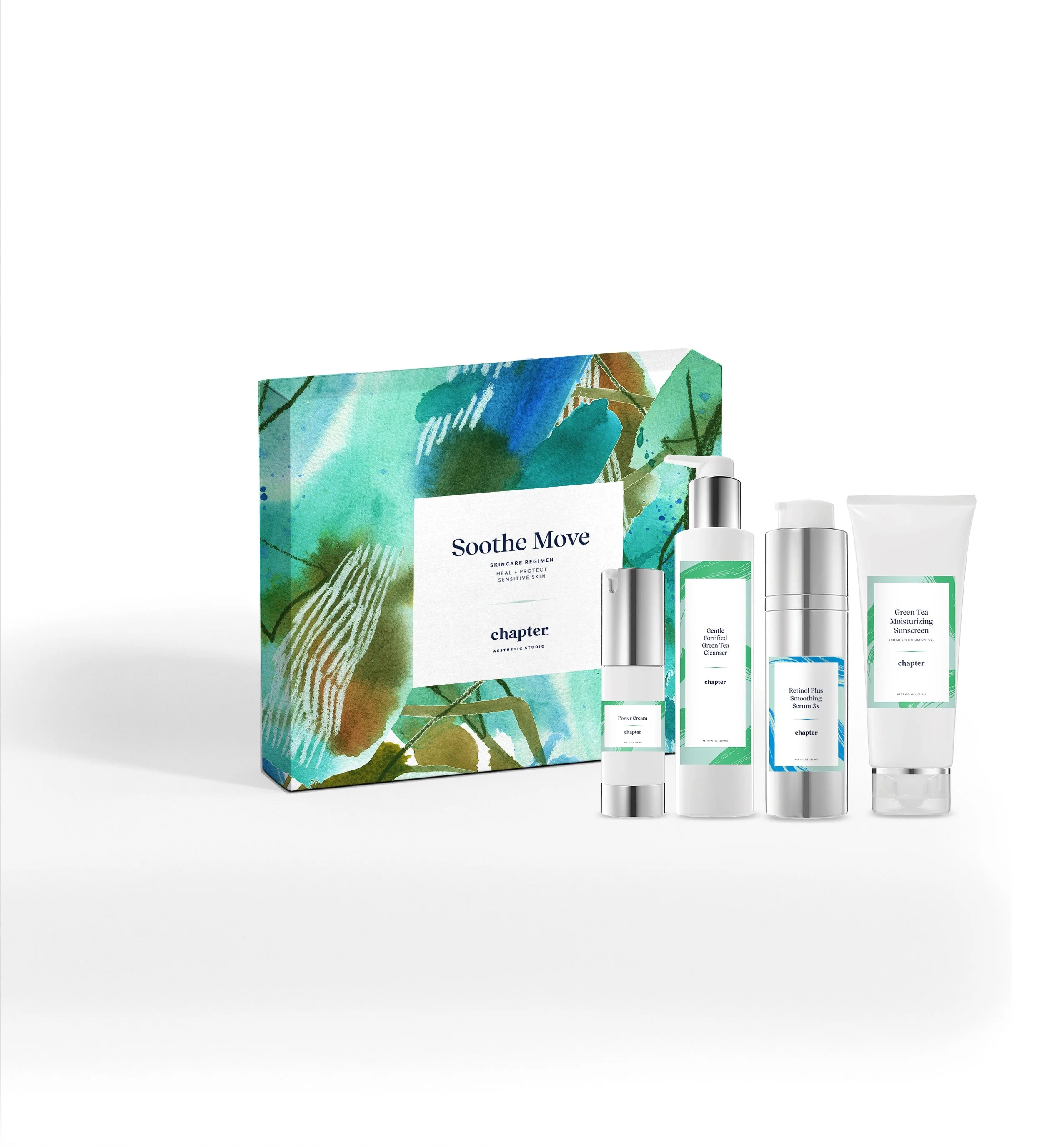
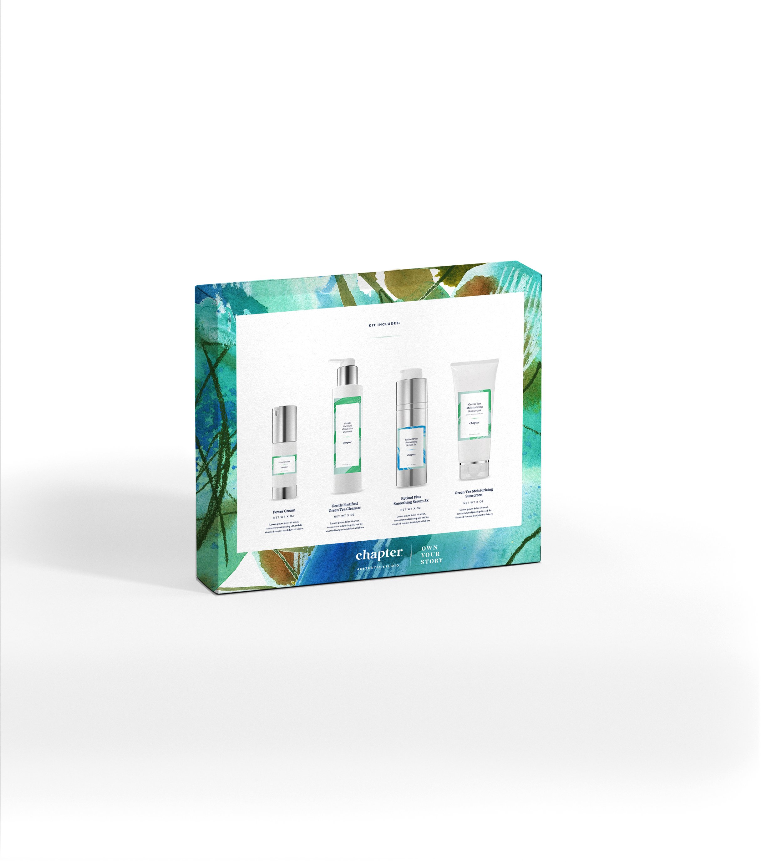
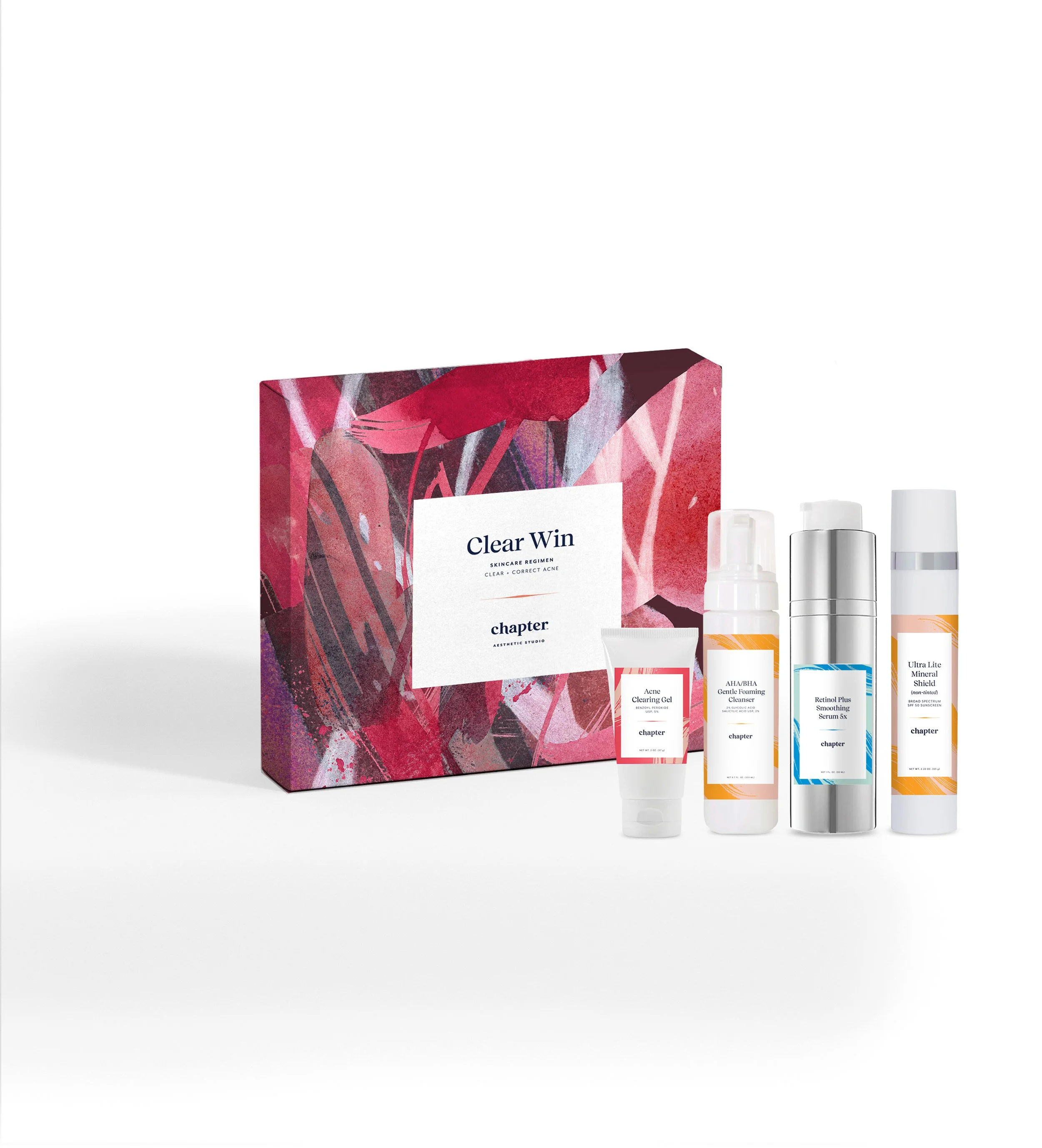
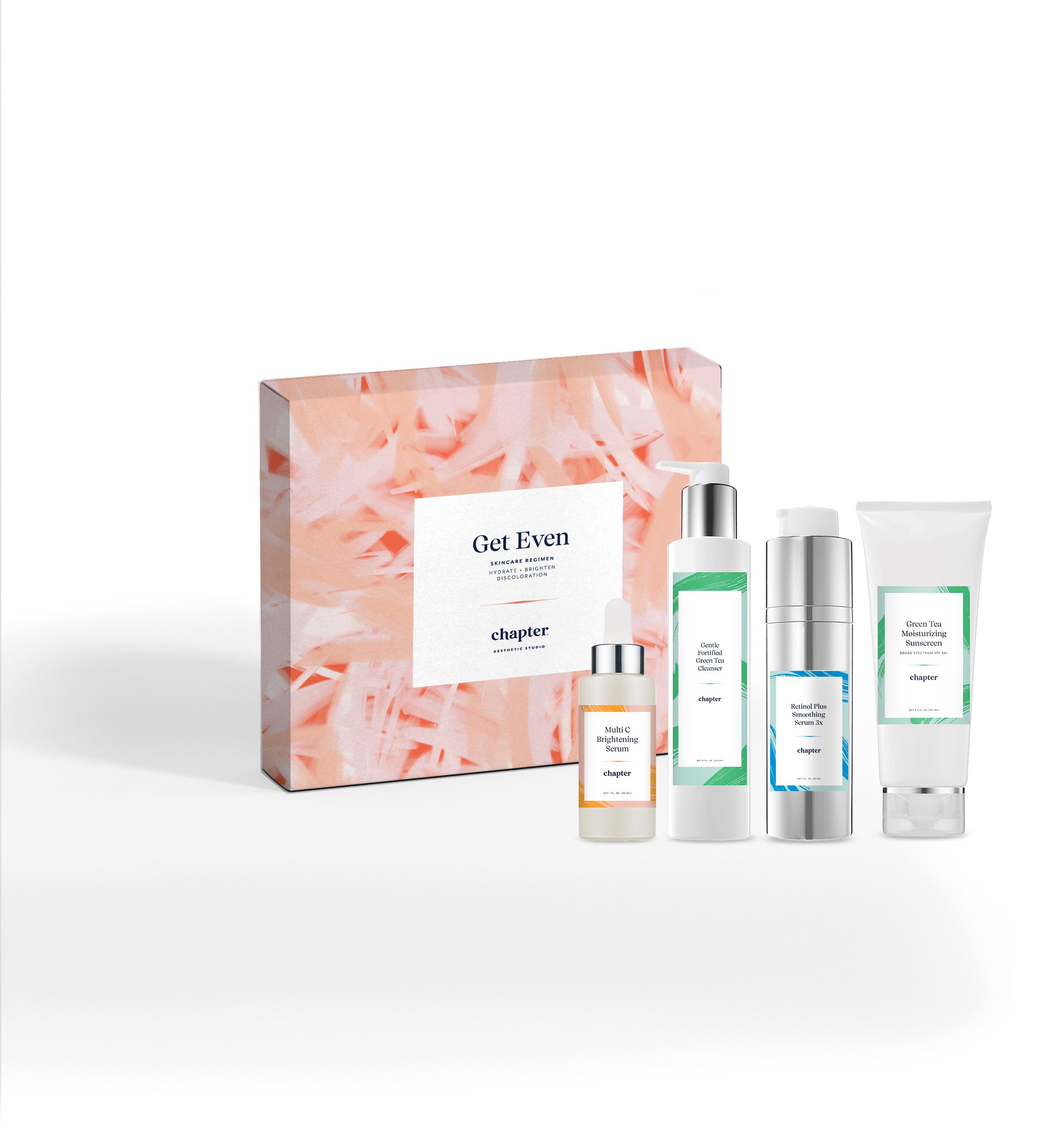
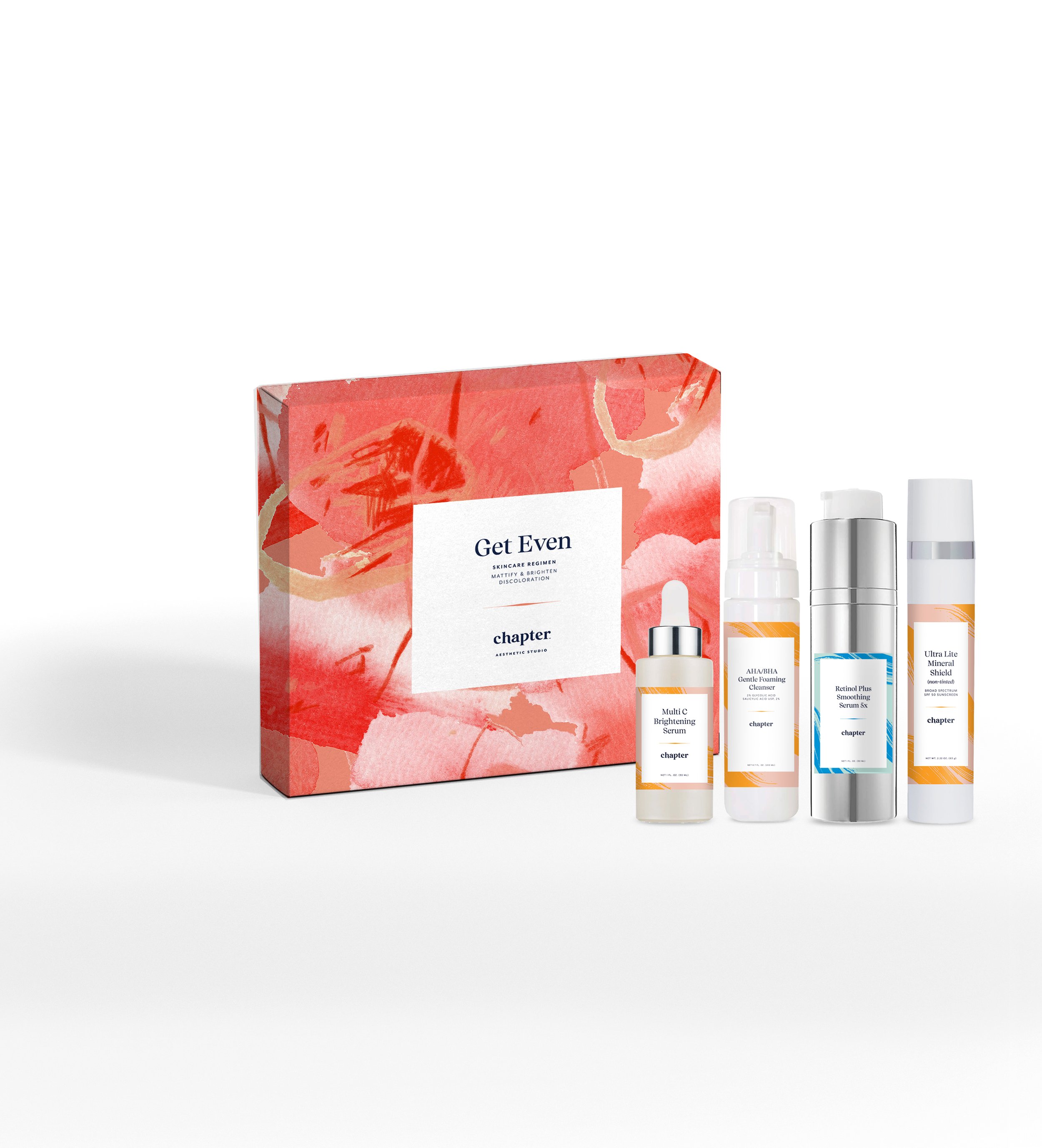
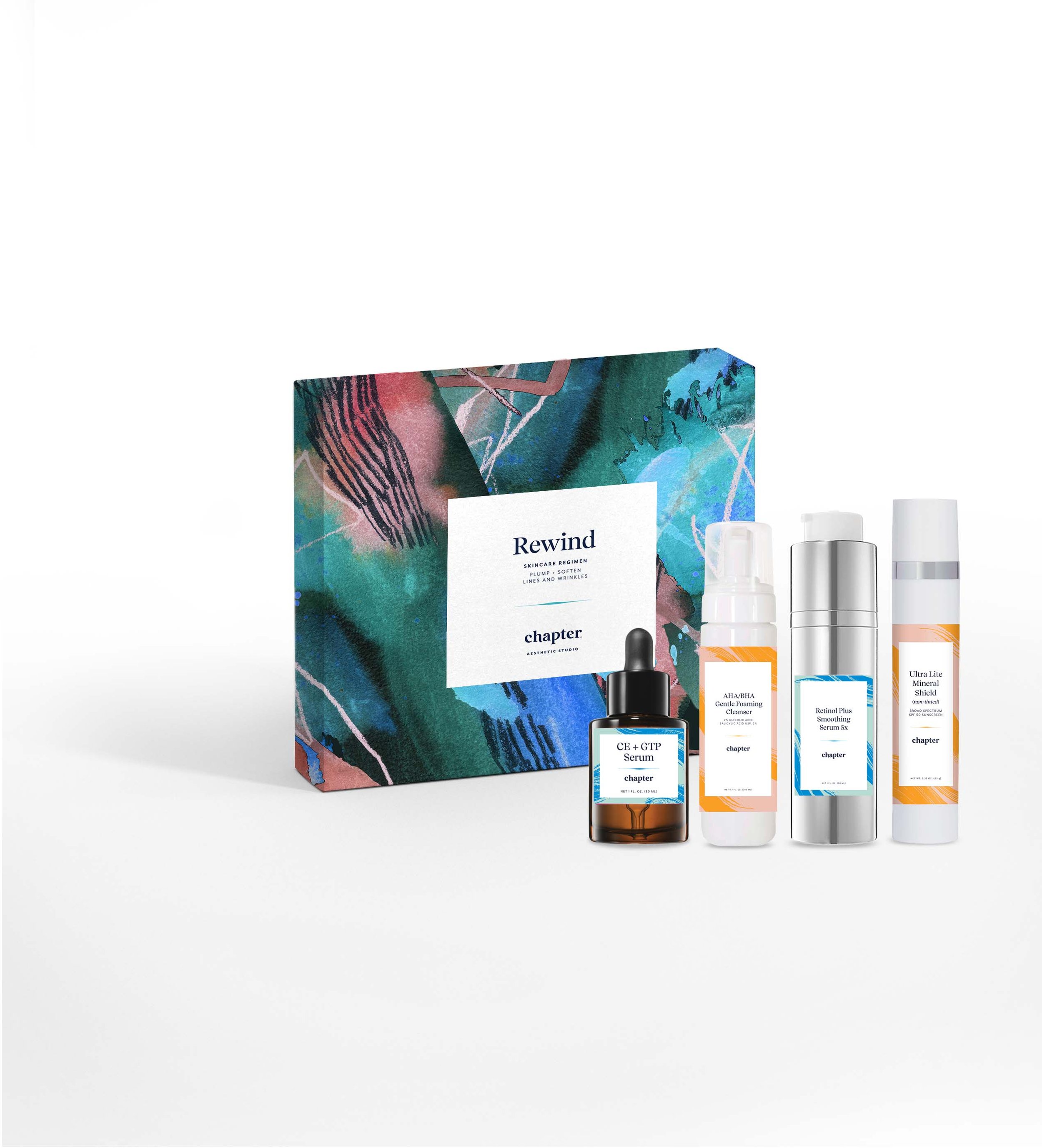
I created a packaging system for their 40+ unique private label skincare products. With a focus on scannable shopability and ease, I developed a color system to cue each products’ purpose (blue for anti-aging and moisturizing, pink/orange for pigmentation, etc.). And for optimal shop-ability, the type layout remains consistent with the product name largest and on top.
Packaging
Skincare Regimen Kits
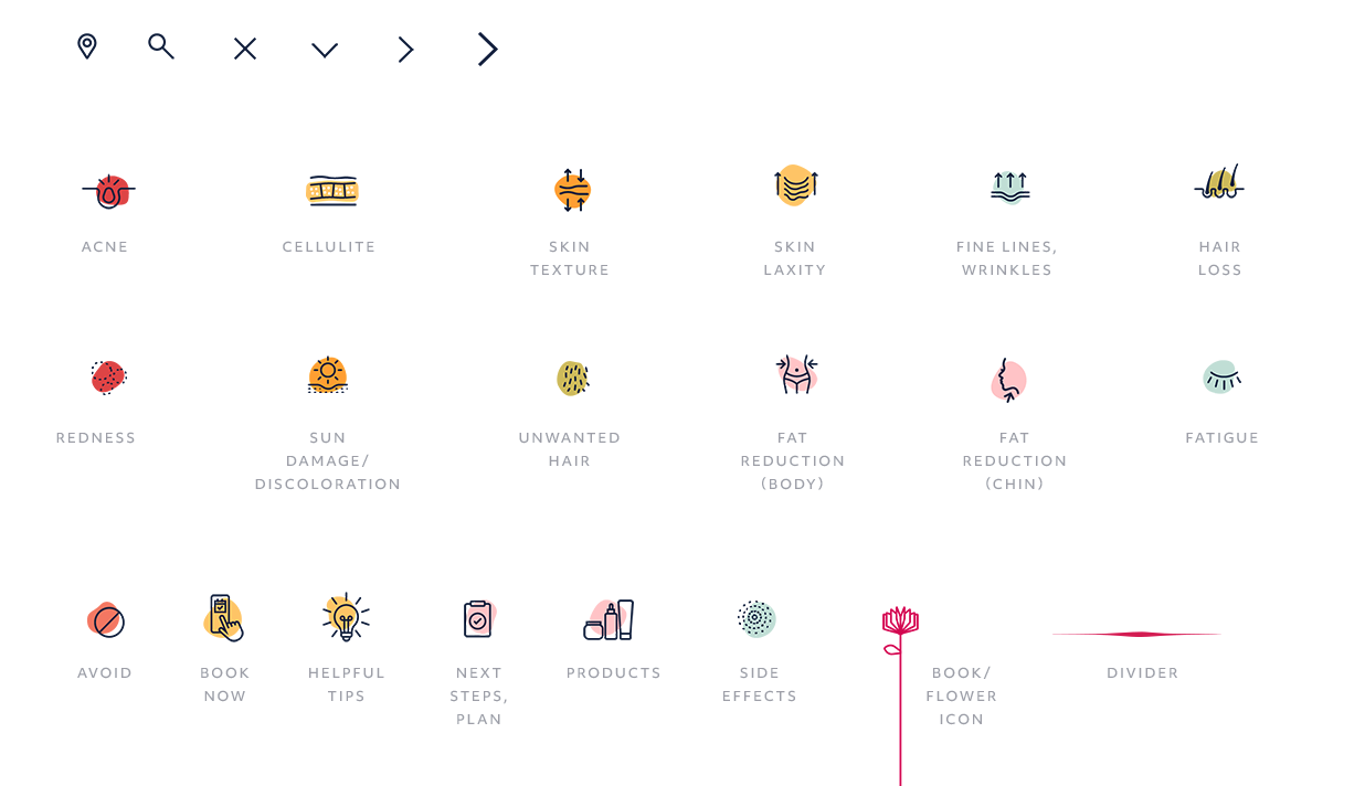
Icon System
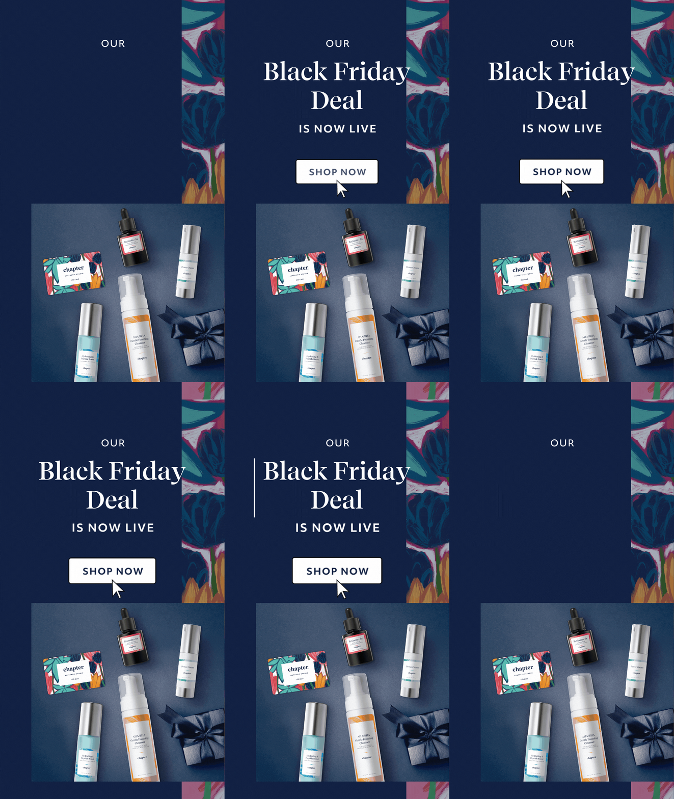
Social
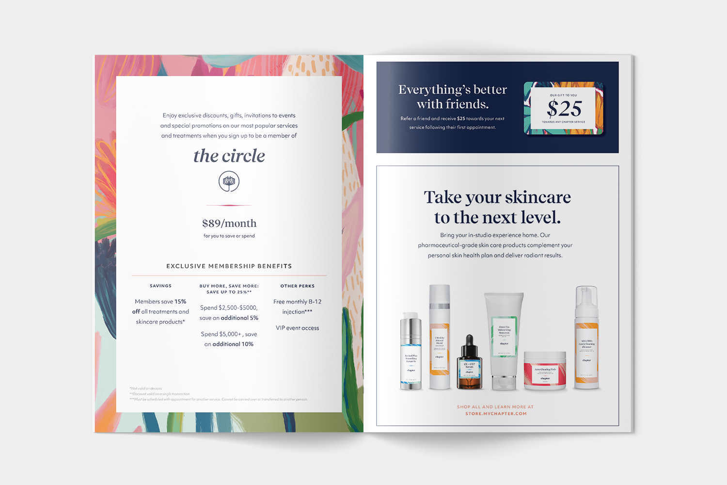
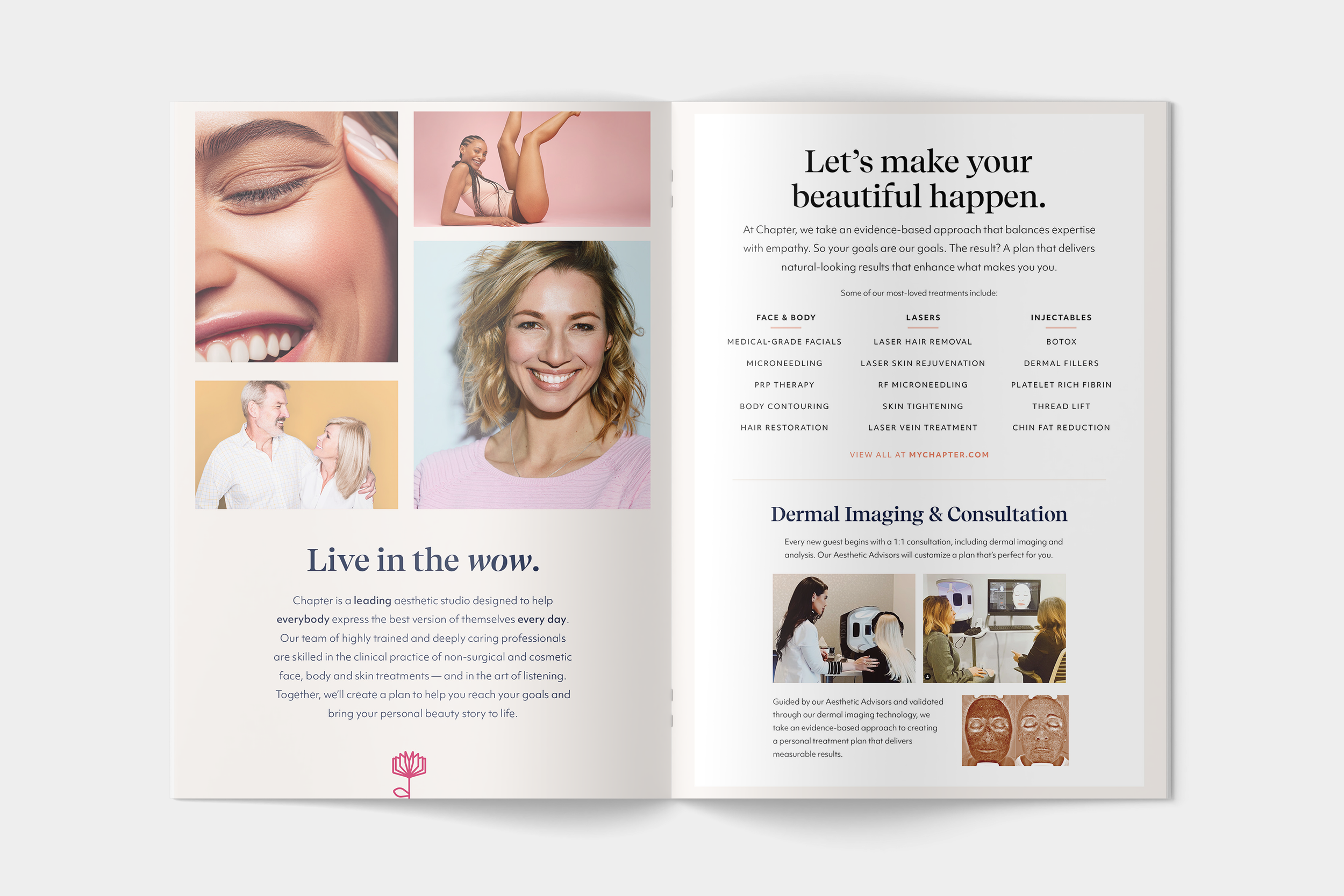
Collateral
Influencer Kit, Exterior
Influencer Kit, Interior
Treatment menu
Referral gift card
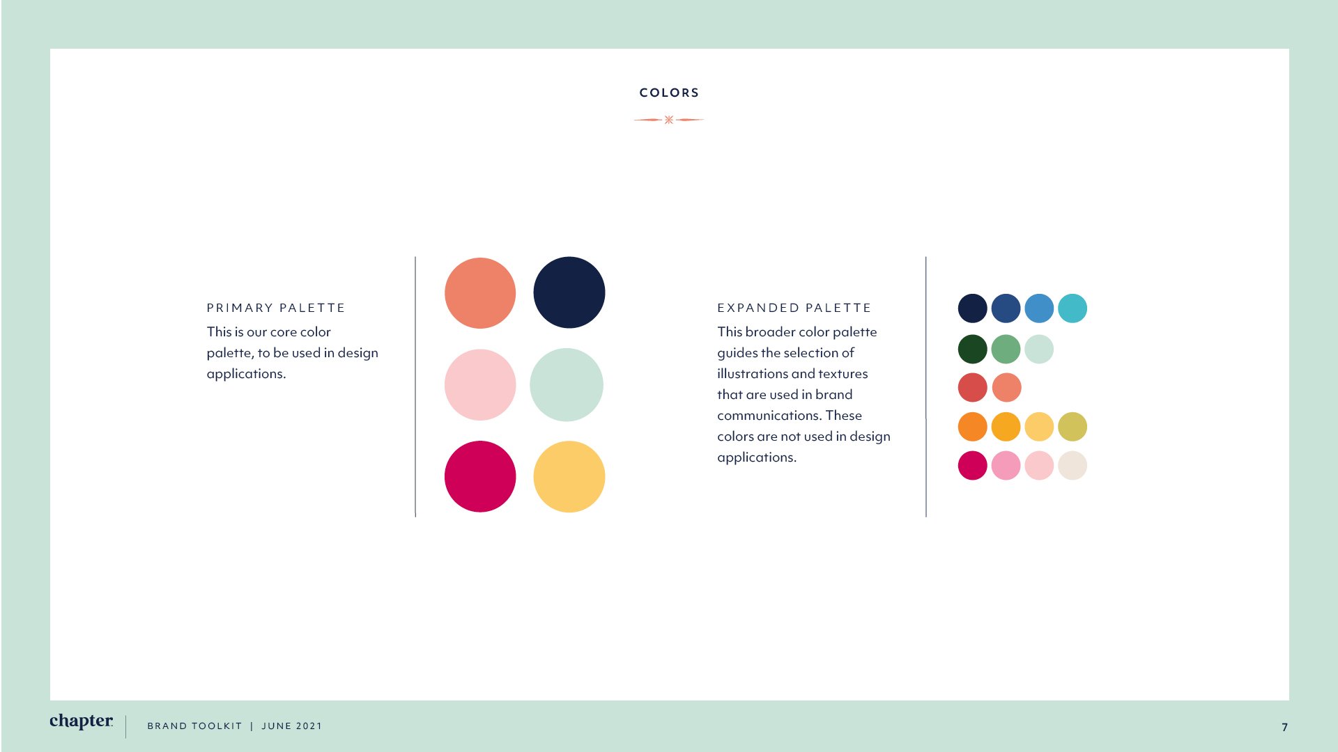
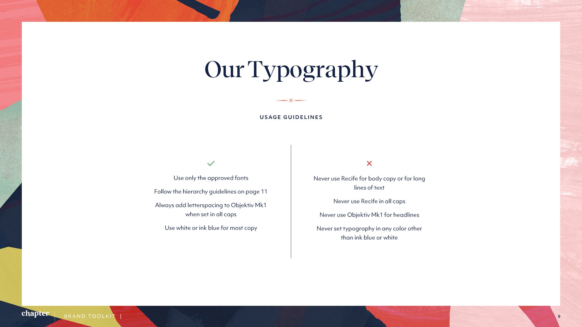
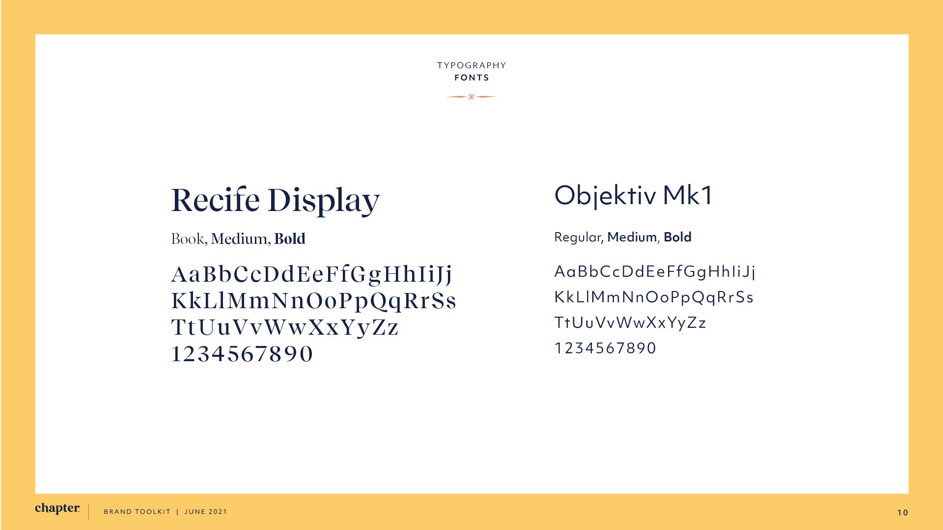
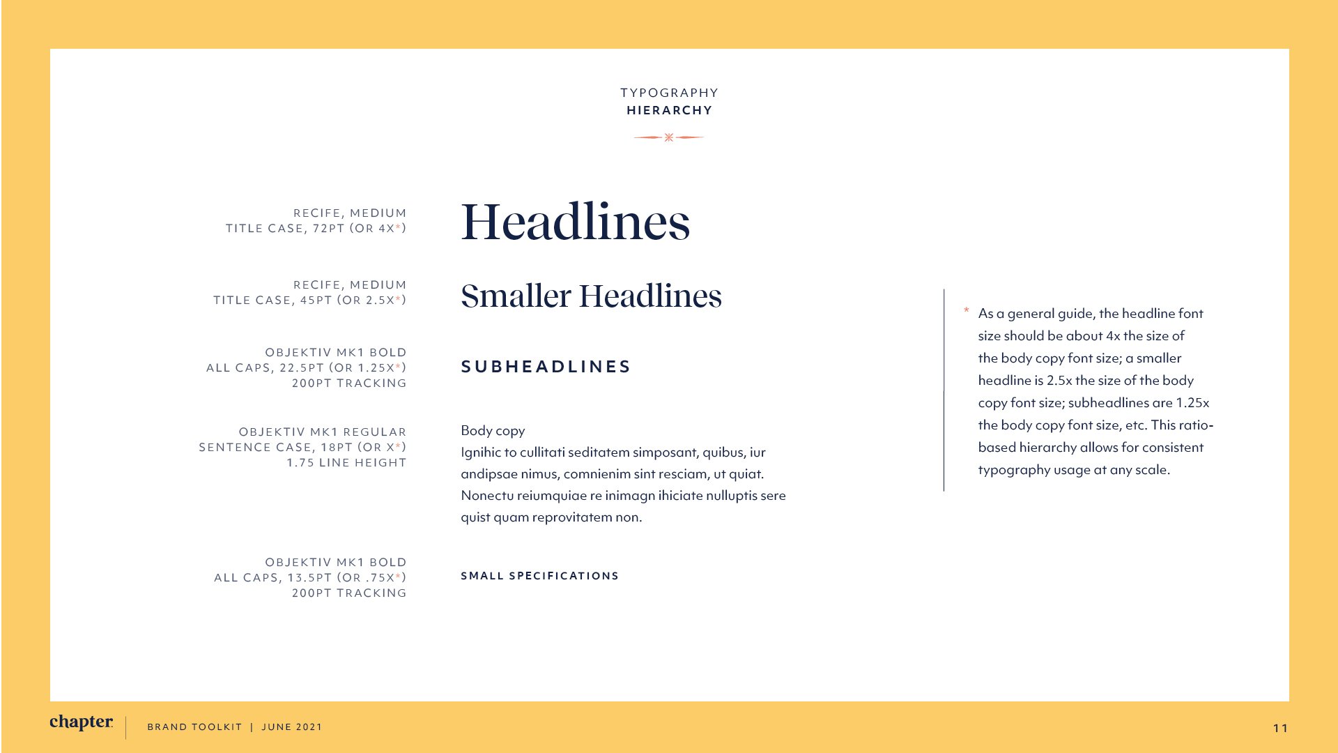
Brand Toolkit
